 Enquiry Now

 Contact Us


 Check Out
 +44 20 4571 2395

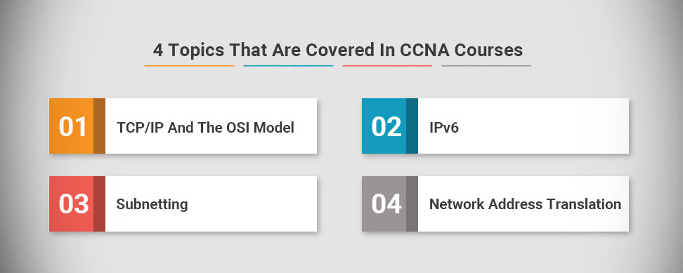
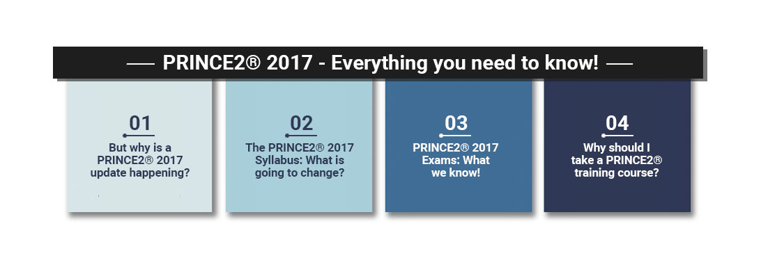
 PRINCE2® Foundation and Practitioner Training


Responsive Web Design is happening right now, it has hit the mainstream and will be around for quite a while. Once you've been on our Responsive Web Design course, there are a huge number of online tools to help you switch to a responsive design workflow and develop your skills and your sites even further. In this post, we're going to run through some of the best.
Responsive Design Workflow: You’re Going to Need a lot, Less Paper!
Workflows are changing with responsive design: there’s less reliance on mock-ups and more emphasis on HTML and CSS prototypes. Although these take longer initially, iterations in response to client feedback are much quicker as they can be done live. Responsive design heavily supports CSS instead of graphics wherever possible, meaning that the majority of tweaks will be made in the style sheet.
Read the case studies below to see what’s involved:
Luke Wroblewski - An Event Apart: The Responsive Designer’s Workflow
MEric Bidelman - Mobifying Your HTML5 Site
Wireframing Templates
Wireframes now need to include a range of devices, as well as consider how easy it is for the user to tap on areas of the screen. These free templates enable you to sketch your design on actual size, pre-created templates for seven mobile platforms.
 Giselle
 22 Nov 2012
One of the toughest jobs for in-house designers is choosing fonts. From the company logo (visible on all digital and print copy as well as signage) to copy on the website, it’s important to think carefully about the font you use to reflect your brand’s identity and establish a recognisable look.
Designers are fairly limited when it comes to web copy; you should set a fairly standard font so that it can be displayed by all browsers.
However, when it comes to print and graphic design you are free to play around with typography and can experiment with different typefaces or even create your own!
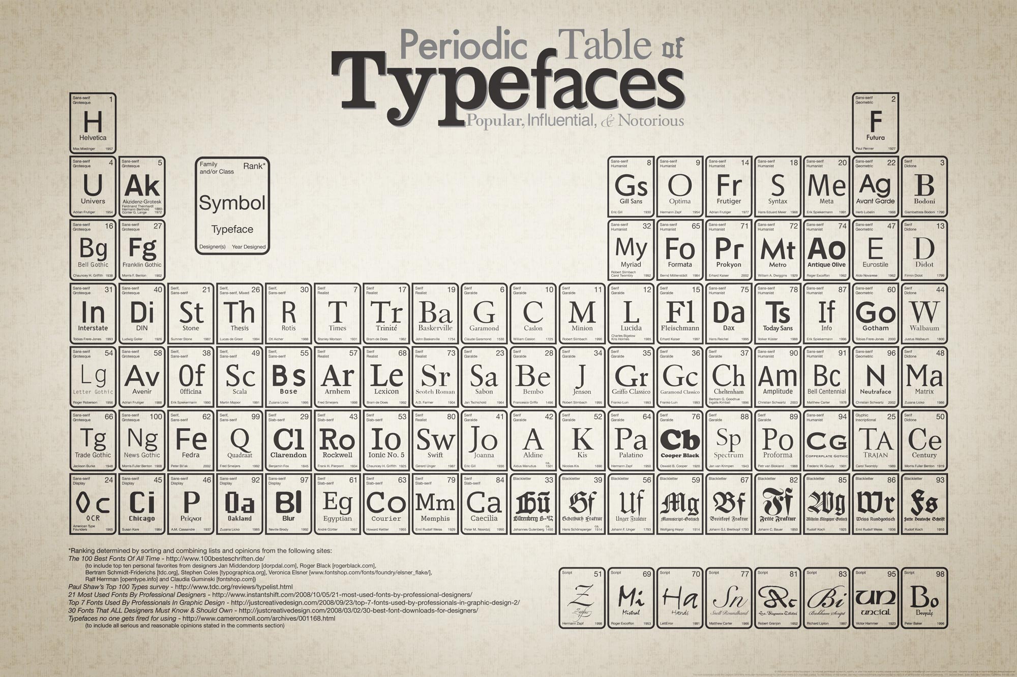
Periodic Table of Typefaces. Click for the full size version.
You can make small adjustments to a basic font (Arial, Helvetica, Tahoma etc.), download somebody else’s custom font from one of the many free font sites (check for commercial licensing first!) or even create your own custom typography.
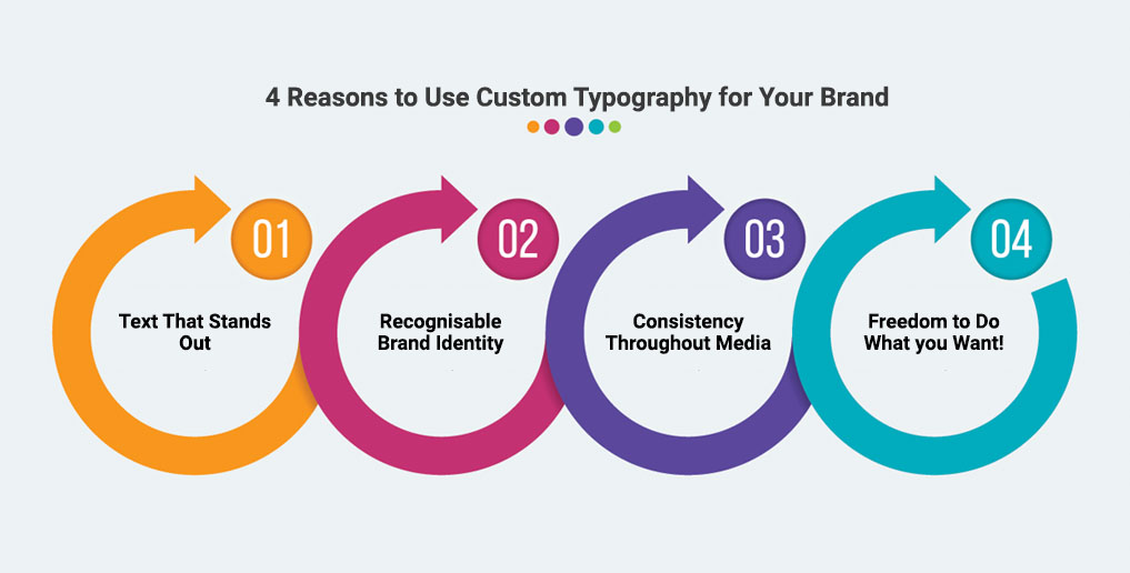
As a branding tool, custom typography is the ideal solution. Customers will easily recognise media that belongs to you. Some people draw the line at creating custom text for just their business logo, but we recommend going a step further and creating an entire custom typeset.
You may need to hire in a typography expert but the tools are available for anybody to have a go using Adobe Illustrator. After attending our Illustrator workshop you will have all the skills needed to start creating your own typefaces, although we don’t cover typography in detail on the course. If this is something you are interested in learning we can tailor our courses to your requirements.
Once you have created your custom font, you can then use it in Photoshop & InDesign when editing and creating graphics for your web and print materials.
So why should you spend time and resources creating a custom typeset for your business? Here are my top 4 reasons!
Aaron Charlie
27 Jun 2012
One of the toughest jobs for in-house designers is choosing fonts. From the company logo (visible on all digital and print copy as well as signage) to copy on the website, it’s important to think carefully about the font you use to reflect your brand’s identity and establish a recognisable look.
Designers are fairly limited when it comes to web copy; you should set a fairly standard font so that it can be displayed by all browsers.
However, when it comes to print and graphic design you are free to play around with typography and can experiment with different typefaces or even create your own!
Periodic Table of Typefaces. Click for the full size version.
You can make small adjustments to a basic font (Arial, Helvetica, Tahoma etc.), download somebody else’s custom font from one of the many free font sites (check for commercial licensing first!) or even create your own custom typography.
As a branding tool, custom typography is the ideal solution. Customers will easily recognise media that belongs to you. Some people draw the line at creating custom text for just their business logo, but we recommend going a step further and creating an entire custom typeset.
You may need to hire in a typography expert but the tools are available for anybody to have a go using Adobe Illustrator. After attending our Illustrator workshop you will have all the skills needed to start creating your own typefaces, although we don’t cover typography in detail on the course. If this is something you are interested in learning we can tailor our courses to your requirements.
Once you have created your custom font, you can then use it in Photoshop & InDesign when editing and creating graphics for your web and print materials.
So why should you spend time and resources creating a custom typeset for your business? Here are my top 4 reasons!
Aaron Charlie
27 Jun 2012
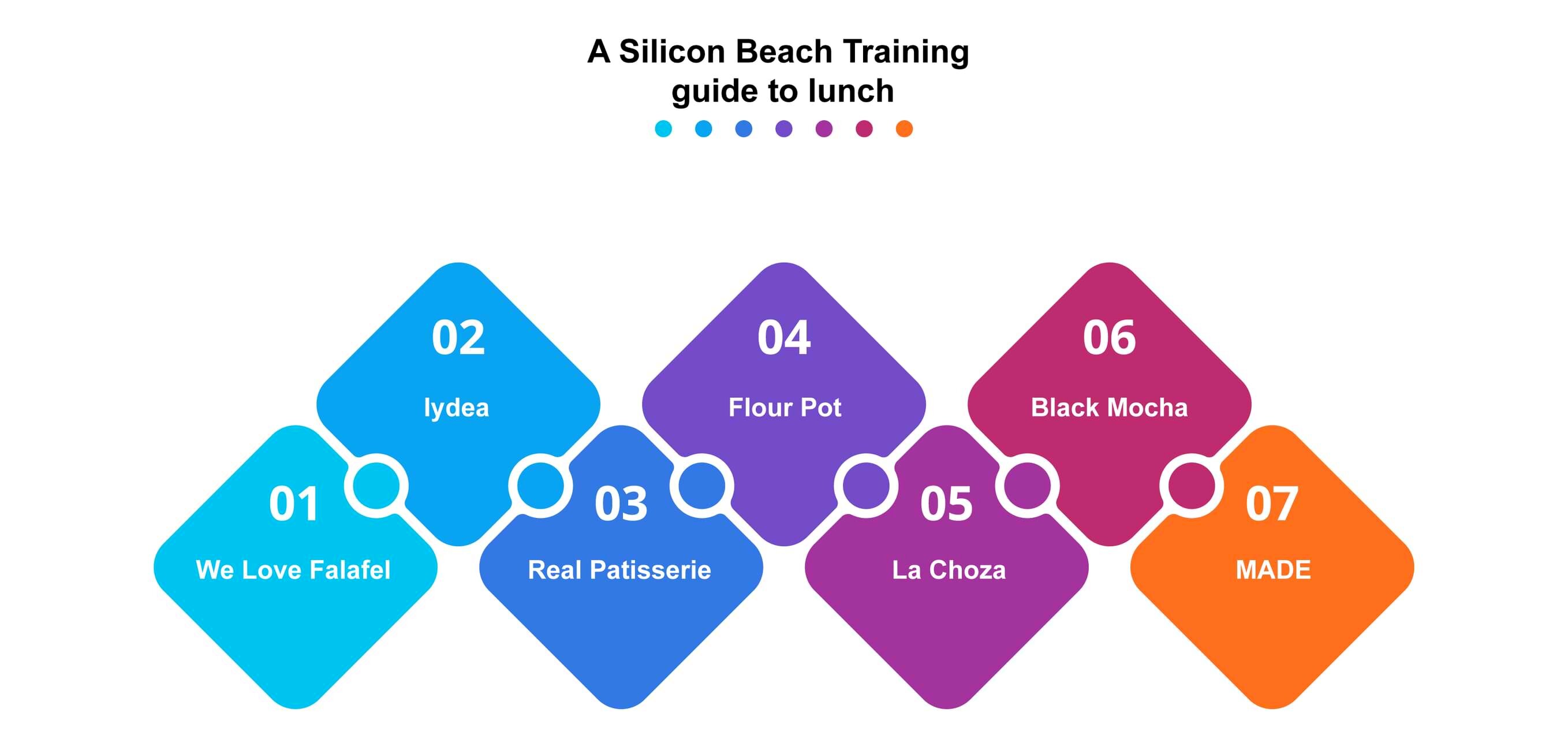
For those of you that know Brighton, you can be a testament to the fact that it is filled with a myriad of great places to eat and drink for every kind of consumer. When you’re here for just a short time knowing where to go on your lunch break is of great importance to most!
Don’t stick to the boring sandwich but taste a bit of Brighton without breaking the bank, here are a few of our favorites...... our 7 lunch wonders of Brighton!
Our key to pricing:
£ - under a fiver
££ - between £5 and £10

Pastrami Sandwich from Flour Pot, Image courtesy of Restaurants Brighton
Sarah Longbottom
17 Jun 2016
It is very easy to open up your website on a smartphone or tablet and make the snap judgement that because it loads and the links work you can leave it as it is. However, how many businesses go the next step and think about how usable their site is on mobile devices? Or how attractive it is?
In this blog post, we have produced a checklist to help businesses perform a mobile site audit to ensure their site is as mobile-friendly as possible. Click the image to download theSilicon Beach Training Mobile Web Design Checklistand then read through this blog to find out why each point is so important.

Come on one of our Mobile Development Courses to learn how to create mobile websites and apps from scratch from our industry expert trainers. We run a beginners Mobile Web Design course which is suitable for all skill ranges and aMobile Web Design Week workshopwhich is more advanced, containingHTML5, CSS3andJavaScripttraining alongside an overview ofmobile web best practice. For the more experienced programmers, we also provideiPhone App Development trainingandAndroid App Development Training. Read on to find out why mobile should be a top priority for business in 2012...
Why Go Mobile?
 Regular visitors to the site will know how strongly we believe that the future of technology lies with mobile. Our recent mobile post highlighted howApple sold more iPhones and iPads in 2011 than they sold computers in 11 years. That is a staggering stat. Another recent figure claims that1.45 million mobile devices enter the world every day compared to 317,124 births.
For whatever reason, mobile devices have achieved something that desktops and laptops never truly managed - they have become a consumer device. Nobody sees a desktop sitting at home, but people go out of their way to flaunt the latest smartphone and read the news on their iPad on the way to work. They have become a fashion accessory as much as a communication device.
As a result of this, more and more people are accessing the internet on the go on smaller screens. Any business that has not considered a mobile strategy is potential missing out on interest and sales. Mobile use has been proven to have a higher click through rates and higher average spend. So not only are some businesses missing out on potential customers but those customers are likely to spend more money!
Silicon Beach Training Mobile Web Design Checklist
This downloadableMobile Web Design Checklistis not a definitive guide to styling websites for mobile devices but it is a useful list of features to consider to ensure a website works properly on a mobile device.
Craig Charley
2 Mar 2012
Check out our updated post on how to get the perfect
social media cover photos;including for the new Google+ Layout.
Download and unzip our Photoshop Template
Step 2:
Open up the template in Photoshop. We've left the images of my face in the template so you can see how it all works - but if you don't want to see my face (and I can sympathise with your position if you don't) then either hide or delete the "Colin" Layers!
Next you'll want to import the image (or images) that you want to use in your own profile.
To do this, select File > Place and select your image file.
Drag and resize it so its in the correct position, and hit enter to place it:
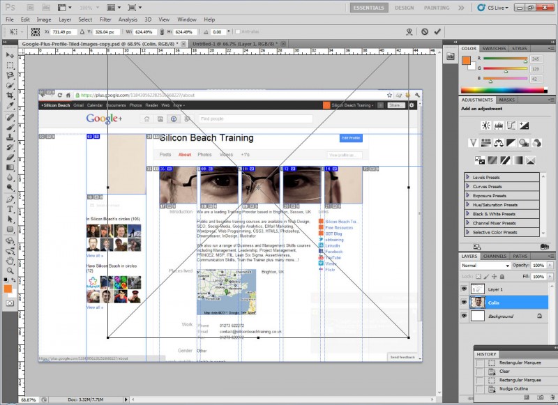
Click on the image for full size version
Aaron Charlie
9 Jul 2011
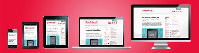
NEW! We've launched our ownResponsive Web Design Course. Learn how to design and build sites that will render on any screen without losing functionality with our best practice workshop. Combine the course with HTML5, CSS3 & JavaScript on our Mobile Web Week and you will be able to build your own sites from scratch!
5 years ago, the only considerations web designers really had to deal with when designing for different users were cross browser testing and different screen resolutions.
 |
Today (and forevermore!), to ensure that your website is truly accessible to all of your users, you have to make sure that your design works for a huge range of mobile devices - iPhones, iPads, Blackberries etc etc... all with different browsers and screen resolutions (many of which are now in 'portrait' orientation, as opposed to the traditional 'landscape' web browser)
One way of doing this is to design a different version of your site for every device - however that's a lot of work.
Enter Responsive Web Design..
What is Responsive Web Design?
Responsive Web design is an approach to web design that ensures that your site responds to your user’s environment, and to their behaviour, based on a range of variables including screen size, platform and orientation.
Rather than create multiple versions of a site for each device - ONE website design will be suitable for all users, by using flexible layouts, images and CSS techniques including media queries. The website adjusts itself to the user - rather than the other way round.
HTML5 and CSS3 are an important part of responsive web design, and as more and more browsers begin to support these technologies responsive websites will become more popular.
Aaron Charlie
20 Jun 2011
Thank you to everyone that entered our Environment Photography Competition - as ever the standard of entries was exceptional and our judge Martin Bailey spent an agonising weekend judging them all for us.
So - the moment you've all been waiting for!
Thanks to Pete Davies (AKA @petedaviesmusic) for providing the music.
Aaron Charlie
3 Jun 2011
 Need Any Help?
Recent Blogs
 Enquire Now


