 Enquiry Now

 Contact Us


 Check Out
 +44 20 4571 2395

 PRINCE2® Foundation and Practitioner Training


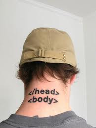
HTML has had many incarnations over the years. All of these are similar, but successive refinements have been added over time to cope with our evolving understanding of the best way to make a website.
HTML5 has been on the radar for a while. As new browsers (including the new Firefox 4) start to support a wider range of HTML5 features, it's use among developers is sharply on the rise. To meet demand we now offer a regular public HTML5 & CSS3 Training course, which builds on the knowledge gained in our existing HTML& CSS Training Course.
We also provide a range of other Web Design courses including our Web Design Week and more advanced programming courses such as JavaScript, AJAX and jQuery.
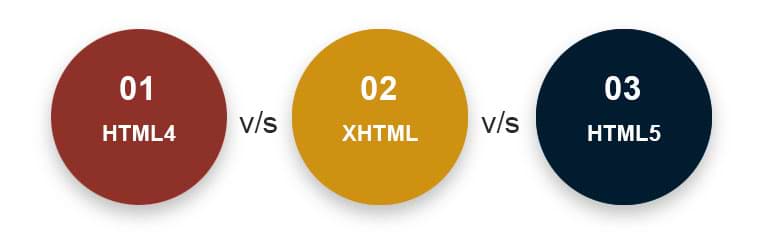
We still get asked a lot of questions about the different versions of HTML - especially the differences between HTML4 and HTML5. Throw XHTML in to the mix and it can be a confusing picture for the uninitiated!
So - here's our quick summary of the three main types of HTML in use today...
 Aaron Charlie
 30 Mar 2011
In this post, our responsive web design trainer Giselle guides you through the differences between Media Types and Media Queries with regards to modern web design.
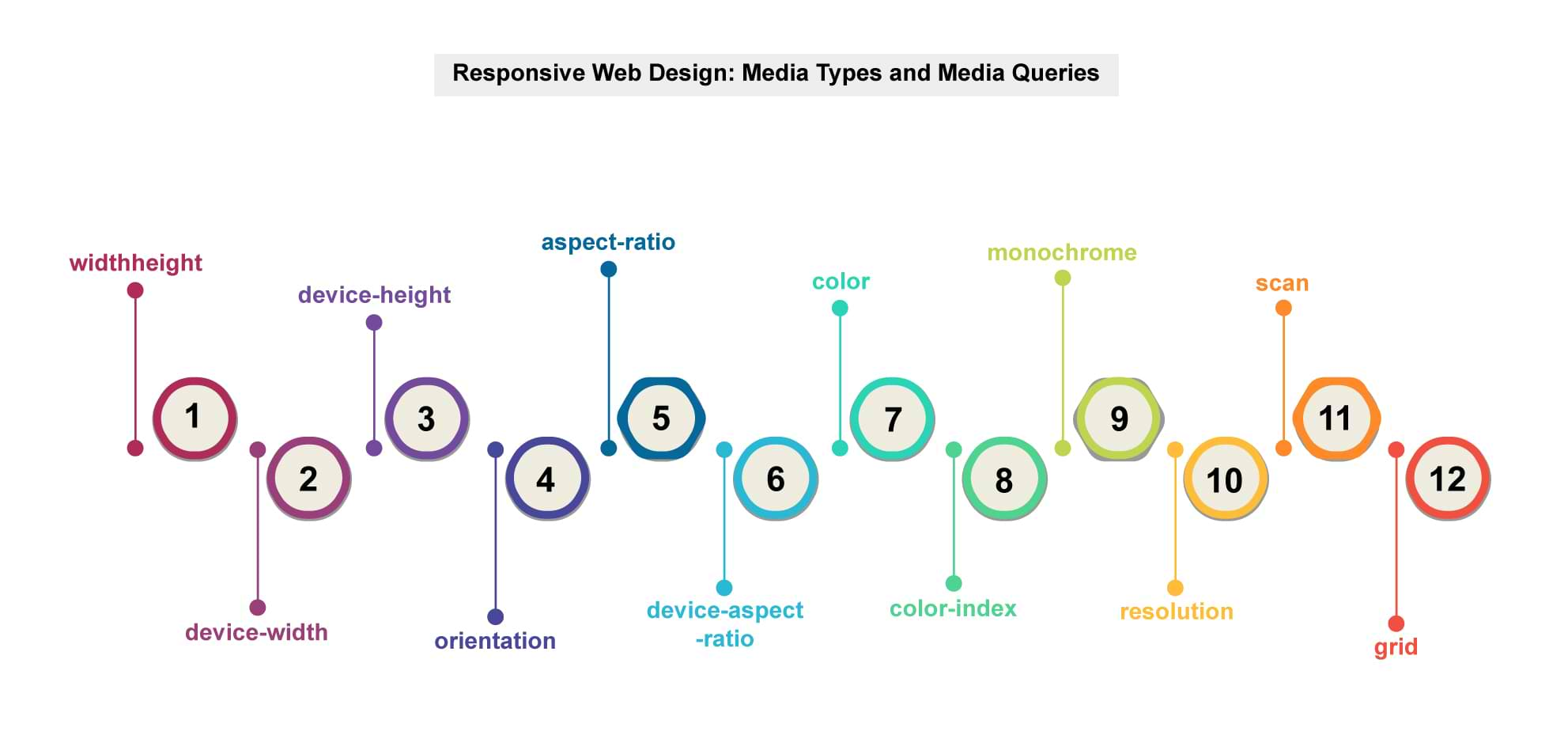
Media queriesis a new module in the CSS3 W3C (World Wide Web Consortium) specification. Media Queries combine the older Media Types, which target a particular media type - e.g. a screen - with conditions that must be met by a particular device in order for a set of styles to be applied to it - e.g. the width of a screen. Media queries enable you to change the appearance of your site for different devices while the HTML remains the same (although some of it may be hidden).
You can learn more about Media Queries in ourResponsive Web Design training.
Media Types
In the CSS2 specification Media Types targeted different devices but did not allow you to differentiate between devices of the same type but with different physical characteristics, e.g. two mobile phones with different screensizes.
Stylesheets for specific media were specified in the
of a page,
Orwithin a style sheet,
@media print {
body {
font-size: 12pt;
}
}
Other difficulties with Media Types included the fact that early mobile device browsers ignored them for the most part and later browsers defaulted to screen-based style sheets.
Giselle
4 Jan 2013
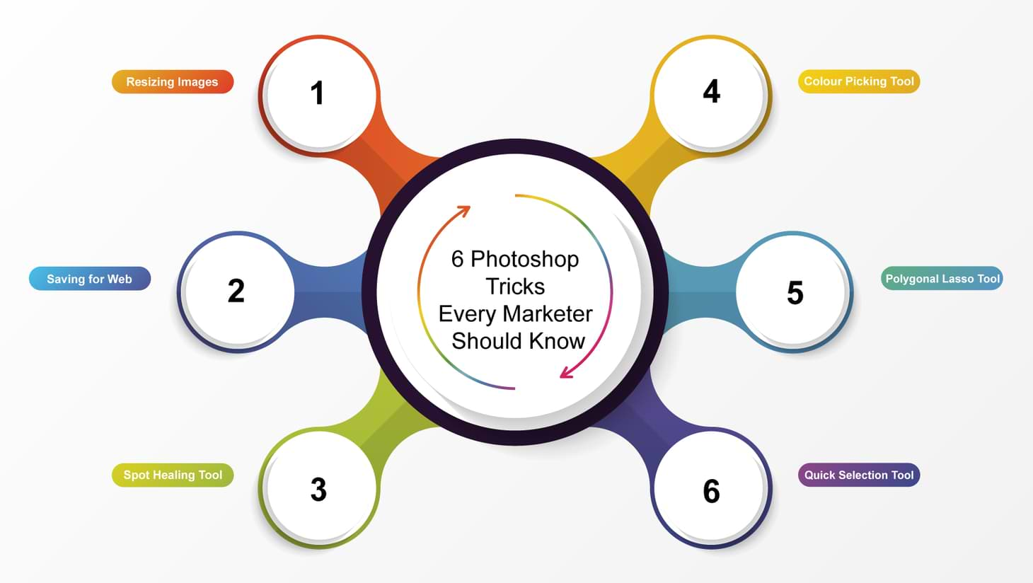
If you aren’t having sleepless nights over the absurdities of the Polygonal Lasso tool then you’re missing out on modern marketing’s favourite tool.
Photoshop is like skydiving. At first it’s terrifying. Many spend their wholes lives without having done it. Most are too timid to commit to the climb. But minutes in, as you reach the peak of your ascent you feel like you’re flying…
Wait a minute. You are flying? It feels unnatural, you’re in uncharted territory. One glance over the edge and your world as you know it comes crashing down. Chaos, anarchy…elation? The void of uncertainty is overwhelming, there's so much you never knew...
Touchdown. You’ve just had the most incredible marketing revelation of your life; you’re dying to try it again. Soon you’ll be so obsessed with swatches and layers that you’ll find yourself convincing your first born to stop eating play-doh and start designing his graphics in-house. Why can’t everyone else see that smart objects are the best thing since sliced bread?
Have I ever been skydiving? Perhaps not.
Is Photoshop really the best thing since sliced bread? Undeniably.
Is there a company that can provide a quality two-day Photoshop Training course, preferably in the centre of Brighton?
Keep reading and find the six Photoshop techniques every marketer needs to know.
Aaron Charlie
28 May 2015
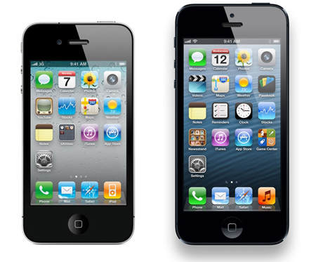
Responsive web design is vital for making sure your visitors get as great an experience on their mobile as their desktop while browsing your site.
Our tutorials often aim at the beginner end of the scale, but this week we're going for something a bit more advanced. In this tutorial our HTML5 & CSS3 trainer Giselle explains how to convert navigation to a dropdown menu for smaller screens using CSS3 media queries.
This is one of the topics covered on our Mobile Web Design Week which combines our HTML5 & CSS3 Course with JavaScript training to give you a tool kit for designing mobile sites and also teaches you a best practice approach for responsive web design.

This tutorial assumes a familiarity with responsive web design and using CSS3 media queries to create different sets of styles for mobile devices. Click the links to find out more.
You do not have to test this in a mobile device. To test in your browser, simply resize your screen to the required width.
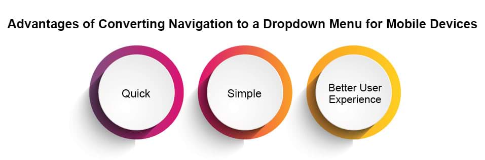
Why Convert to a Dropdown Menu?
If you have more than three buttons in your main navigation your menu will wrap or overlap when you decrease the width of your web page to fit it to a smaller mobile device screen. A popular method to get around this is to convert your menu to a dropdown. Other alternatives are to use display: block, or to use JavaScript or JQuery to toggle a menu when an icon or button is clicked on. Using display: block is a simple and quick way to style navigation for mobile dropdowns but won't work for menus with many links in them. Using JQuery to toggle the menu requires some knowledge of JQuery and JavaScript. Which method you use will depend on the particular site you are working on. This tutorial shows you how to use the first method and is quick and simple to implement.
Giselle
5 Oct 2012
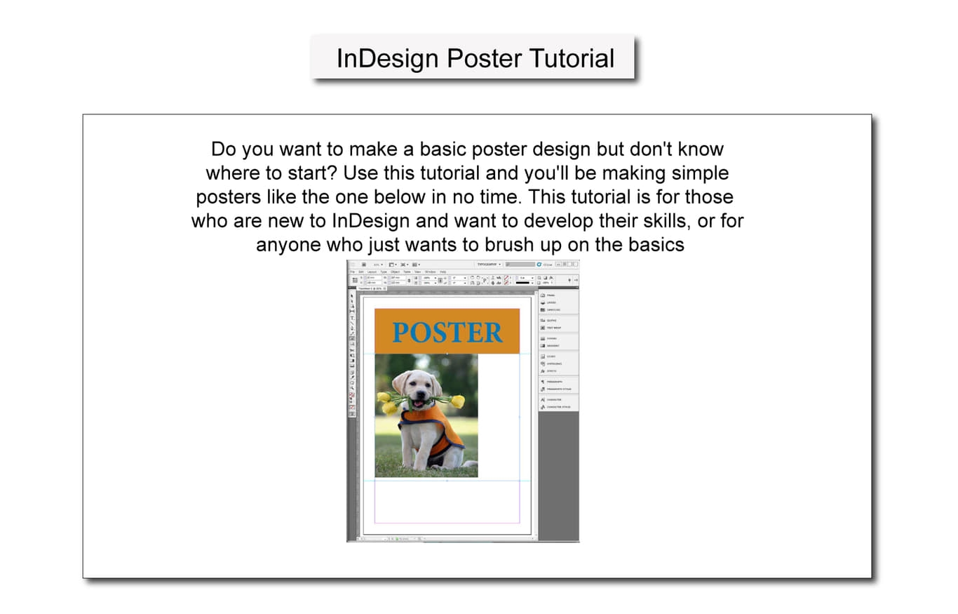
Do you want to make a basic poster design but don't know where to start? Use this tutorial and you'll be making simple posters like the one below in no time.This tutorial is for those who are new to InDesign and want to develop their skills, or for anyone who just wants to brush up on the basics.
If you want to learn more skills for creating posters and other similar projects, try one of our Adobe Courses which include InDesign and Illustrator or one of our popular Photoshop Training Courses.

Firstly, open the program and click on the "Create New - Document" button
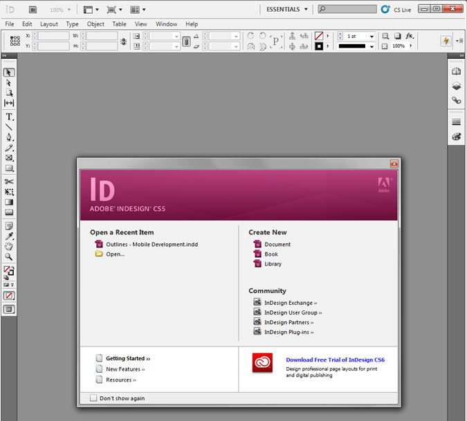
The document setting screen will appear. Choose the page size - for this example we will use A3 - and the margin size. It's good to have around 20 mm of margin for a project like this. Put the same value as the margins in the "Gutter" box.
Make sure you un-check the "Facing Pages" box, keep the default "portrait" setting and then press OK.
Aaron Charlie
30 Nov 2012
Do you want to make a basic poster design but don't know where to start? Use this tutorial and you'll be making simple posters like the one below in no time.This tutorial is for those who are new to InDesign and want to develop their skills, or for anyone who just wants to brush up on the basics.
If you want to learn more skills for creating posters and other similar projects, try one of our Adobe Courses which include InDesign and Illustrator or one of our popular Photoshop Training Courses.
Firstly, open the program and click on the "Create New - Document" button
The document setting screen will appear. Choose the page size - for this example we will use A3 - and the margin size. It's good to have around 20 mm of margin for a project like this. Put the same value as the margins in the "Gutter" box.
Make sure you un-check the "Facing Pages" box, keep the default "portrait" setting and then press OK.
Aaron Charlie
30 Nov 2012
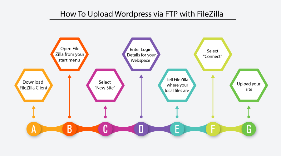
If you're going to attend our Wordpress Training course in Brighton, Sussex, we recommend that you download and familiarise yourself with FileZilla prior to attending. FileZilla is a free FTP client that we use on the course.
If you're not attending the Wordpress course but need to know how to use an FTP client to manage the local and remote files in your website, this guide to setting up FTP using FileZillawill be a useful reference guide.


Aaron Charlie
9 Mar 2010
 Need Any Help?
Recent Blogs

 Enquire Now


