 Enquiry Now

 Contact Us


 Check Out
 +44 20 4571 2395

 PRINCE2® Foundation and Practitioner Training


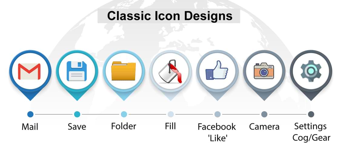
Skeuomorphism is, according to Wikipedia, "a physical ornament or design on an object made to resemble another material or technique." It's a somewhat controversial design technique that has been around for centuries.
In terms of web and mobile design, skeuomorphism is most commonly referred to in terms of icons or even apps and software which use representational design elements that possess little or no functionality. You can learn all about skeuomorphism on our InDesign Training.
An example of it would be the notepad on Apple iOS devices which has been designed to look like a traditional paper notepad. There's no need for it to be designed like this, from a functionality perspective, but the way it looks makes its purpose easily identifiable. The skeuomorphic philosophy employed by Apple is a big part of their approach to making tech simple and ultra-user-friendly.
It's not just Apple that uses this technique though; it has been in use in the tech industry for years, especially with regard to buttons and icons.
But is it a good thing? Should we really be using symbols that don't mean anything in terms of the app or software?
 Aaron Charlie
 29 Apr 2013
Skeuomorphism is, according to Wikipedia, "a physical ornament or design on an object made to resemble another material or technique." It's a somewhat controversial design technique that has been around for centuries.
In terms of web and mobile design, skeuomorphism is most commonly referred to in terms of icons or even apps and software which use representational design elements that possess little or no functionality. You can learn all about skeuomorphism on our InDesign Training.
An example of it would be the notepad on Apple iOS devices which has been designed to look like a traditional paper notepad. There's no need for it to be designed like this, from a functionality perspective, but the way it looks makes its purpose easily identifiable. The skeuomorphic philosophy employed by Apple is a big part of their approach to making tech simple and ultra-user-friendly.
It's not just Apple that uses this technique though; it has been in use in the tech industry for years, especially with regard to buttons and icons.
But is it a good thing? Should we really be using symbols that don't mean anything in terms of the app or software?
Aaron Charlie
29 Apr 2013

I fancy a pint (not a rare occurrence) but I just don't know where to go. Perhaps I've just moved to the area or I'm just looking to go somewhere new.
10 or 20 years ago, my best bet would be to accost local passers-by and ask for recommendations and directions.
Well, that's no longer the case!
Thanks to my handy iPhone (I could have an Android device but for the purposes of this I don't) I can now download a smorgasbord of apps that will tell me everything from where the local is to what beer they sell to whether or not they're showing the England game.
I'm using pubs as an example but you can use geo-location apps to find pretty much anything. You could be designing the next big one after coming on our iOS App Development Training.
Geo-location apps are this decade's answer to tour guides and indecision and come in variety of shapes, styles and sensibilities.
I'm going to try as many as possible to work out which one is best for finding my way to a decent boozer, for telling everyone that I'm at a decent boozer (with an obligatory sepia-toned snap of my beverage as an accompaniment) and for various other decent boozer-related information and activity.
I'd like to point out that there are plenty of other things you could be doing with some of these apps aside from abusing your liver; like eating or dancing or something else constructive, it's just that I chose an activity close to my heart.
So for each app I'm going to rate it out of 5 for Usability (how easy it is to use), Choice (how many options it provides), Information (like opening times, WiFi connection etc) and Review System (how good the system for leaving/reading a review is, if there is one at all).
Aaron Charlie
28 Mar 2013
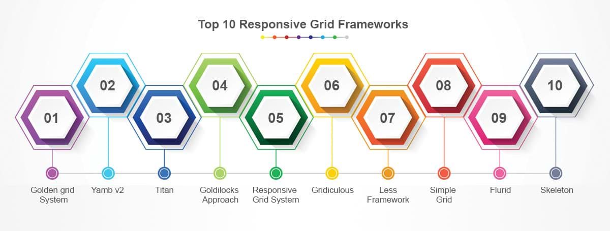
Responsive Web Design is becoming more and more widely used as a means to creating a site that is easily accessible on multiple platforms.
Grids are a particularly useful and simple way to build a responsive site, which is why you'll learn all about them on our Responsive Web Design Training.
With so many options to choose from, we thought we'd take a look at what we think are some of the best frameworks out there, each with its own unique strengths. Not 100% on Media Queries? Take a look at this post on the difference between queries and types.
1/ Golden grid System
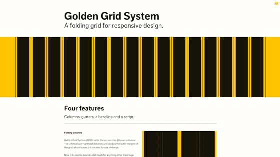
Golden Grid System splits the page into 18 columns, 16 of which can be used for design.
Using this system you'll be able to serve pages ranging from 240 to 2560px. It does this by 'folding' into 8 columns for tablets and 4 for mobiles.
2/ Yamb v2
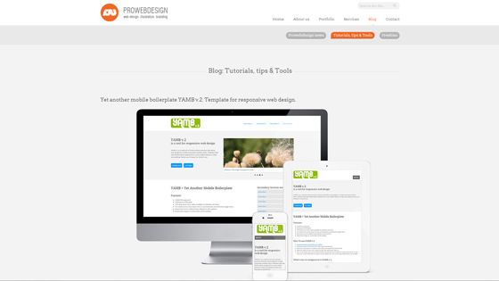
Yamb v2 is a mobile first framework which aims to deliver a minimalist approach to responsive design. As such it covers screen widths from 320px upwards.
Aaron Charlie
25 Mar 2013
CSS3 and HTML5 are changing the way we use the web, and how programmers and web designers build sites. Web browsers are quickly becoming compatible with HTML5 and CSS3's new tags and features, which are opening up a whole new world of possibilities.
One of those possibilities is the use of Responsive Web Design. In a world where mobile web browsing is ubiquitous, Responsive Web Design techniques allow designers to use flexible grids and page layouts in sites that will respond to user behaviour and adjust automatically to the user's browser capabilities and screen resolution of their device (meaning you don't have to make a different version of your site for every mobile phone and tablet out there). We'll be writing more about Responsive Web Design here soon (so watch this space!)
In response to the increase in demand for these skills we're now running regular HTML5 & CSS3 Training courses here in Brighton - the two 1-day workshops are scheduled together and can be booked together as a package. We're also running regular JavaScript Training and jQuery Training courses.
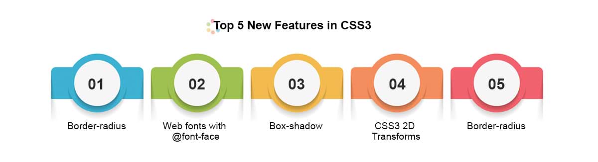
To give you an idea of some of the exciting new things you can do with CSS3 - here's our favourite 5 new features in CSS3, along with links to relevant CSS3 Examples.
Top 5 New Features in CSS3
1) Border-radius
The new border-radius feature in CSS3 comes as a great relief for anyone who has had to create rounded corners with corner images and extra DIVs: all you need is a few lines of CSS. It's not yet supported by IE7 and IE8, but you can use a CurvyCorners Script for these browsers.
CSS3 Border Radius Example
Aaron Charlie
23 May 2011
CSS3 and HTML5 are changing the way we use the web, and how programmers and web designers build sites. Web browsers are quickly becoming compatible with HTML5 and CSS3's new tags and features, which are opening up a whole new world of possibilities.
One of those possibilities is the use of Responsive Web Design. In a world where mobile web browsing is ubiquitous, Responsive Web Design techniques allow designers to use flexible grids and page layouts in sites that will respond to user behaviour and adjust automatically to the user's browser capabilities and screen resolution of their device (meaning you don't have to make a different version of your site for every mobile phone and tablet out there). We'll be writing more about Responsive Web Design here soon (so watch this space!)
In response to the increase in demand for these skills we're now running regular HTML5 & CSS3 Training courses here in Brighton - the two 1-day workshops are scheduled together and can be booked together as a package. We're also running regular JavaScript Training and jQuery Training courses.
To give you an idea of some of the exciting new things you can do with CSS3 - here's our favourite 5 new features in CSS3, along with links to relevant CSS3 Examples.
Top 5 New Features in CSS3
1) Border-radius
The new border-radius feature in CSS3 comes as a great relief for anyone who has had to create rounded corners with corner images and extra DIVs: all you need is a few lines of CSS. It's not yet supported by IE7 and IE8, but you can use a CurvyCorners Script for these browsers.
CSS3 Border Radius Example
Aaron Charlie
23 May 2011
With Microsoft Office 2013 set for release very soon (and after our look at the new mobile excel apps), we thought we'd take a look at some of the new features to be added to its Access software.
The database powerhouse has undergone an overhaul and not just aesthetically. More app-focused, easily shareable and with a revised back-end, Access 2013 is set to build and develop upon the now three year old incumbent, Access 2010.
If you'd like to learn how to use Access from scratch, come on our Beginner's Access Training Course or if you have some experience but would like to brush up on your skills, try our 1 day Advanced Access Workshop.
So what exactly is different about Access 2013 compared to previous versions? And will these differences make the user experience better or worse?
App-Based
The biggest new feature to be brought in with Access 2013 is the focus on a more app-based system.
What with the introduction of Windows 8 and Sharepoint's development into a realistic competitor to Google Drive and Dropbox, it's unsurprising that Access 2013 has such a focus.
In Access 2013 you'll be able to create an app (which can effectively be anything, but we'll assume an Access file!), upload it to Sharepoint and then allow access to anyone you like.
No extra login details are required; just those of the business'/users' Sharepoint account.
Andy Trainer
29 Jan 2013
 Need Any Help?
Recent Blogs
 Enquire Now


