Enquiry Now

 Contact Us


 Check Out
 +44 20 4571 2395

 PRINCE2® Foundation and Practitioner Training


 Giselle
 4 Jan 2013
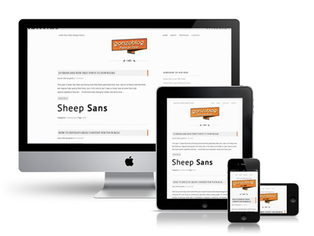
Responsive Web Design: Media Types and Media Queries
In this post, our responsive web design trainer Giselle guides you through the differences between Media Types and Media Queries with regards to modern web design.
Media queries is a new module in the CSS3 W3C (World Wide Web Consortium) specification. Media Queries combine the older Media Types, which target a particular media type - e.g. a screen - with conditions that must be met by a particular device in order for a set of styles to be applied to it - e.g. the width of a screen. Media queries enable you to change the appearance of your site for different devices while the HTML remains the same (although some of it may be hidden).
You can learn more about Media Queries in our Responsive Web Design training.
Media Types
In the CSS2 specification Media Types targeted different devices but did not allow you to differentiate between devices of the same type but with different physical characteristics, e.g. two mobile phones with different screensizes.

Stylesheets for specific media were specified in the
of a page,
Orwithin a style sheet,
@media print {
body {
font-size: 12pt;
}
}
Other difficulties with Media Types included the fact that early mobile device browsers ignored them for the most part and later browsers defaulted to screen-based style sheets.
Check out this article for more information on Media Types.
Media Queries
@media screen and (max-width: 480px) {
body {
font-size: 100%;
}
}
The media query above:
- Starts with a media type, ‘screen’ in this case.
- Is surrounded by parentheses: (max-width: 480px)
- Includes the name of a feature (min-width) and a corresponding value (480px)
- If the browser meets both conditions - i.e. the device has a screen with a minimum width of 480px - the styles within the query are implemented. If it doesn’t, the styles are ignored.
- Uses the max- prefix to test for width. Width is an important consideration in style sheet design and min- and –max prefixes are commonly used to distinguish between viewports above a certain threshold – e.g. 1024px (min-width: 1024px) - or below a certain threshold – e.g. 480px (max-width: 480px).
You can add media queries in several different ways:
With a link using themedia attribute:
OR
Attached to @import statements:
@import url("wide.css") screen and (max-width: 480px);
OR
Using @media within a style sheet:
@media screen and (max-width: 480px) {
body {
font-size: 100%;
}
}
The @media method keeps the CSS in the same file and reduces requests on the server but there are pros and cons associated with using different methods.
This article gives more insight into Media Queries.
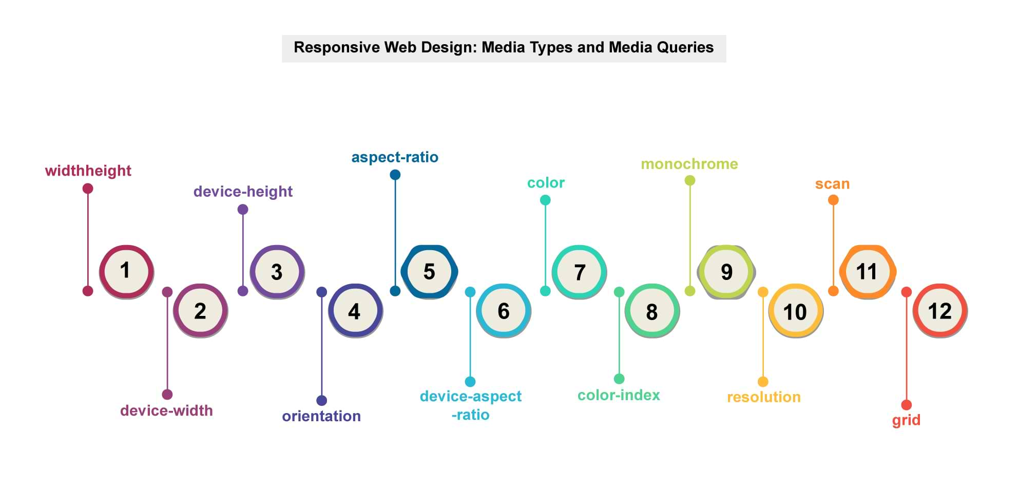
Media queries can test for the following features in a device:
- widthheight
- device-width
- device-height
- orientation
- aspect-ratio
- device-aspect-ratio
- color
- color-index
- monochrome
- resolution
- scan
- grid
You can test for more than one feature in a single query by using the‘and’keyword:
@media screenand(min-device-width: 480px)and(orientation: landscape) { … }
Responsive style sheets have a default set of styles for a specific device, e.g. the desktop, at the top of the style sheet (or linked into the page first). These will be implemented BEFORE being overwritten by specific device-targeted styles.
An important consideration is whether to design for mobile devices first or have a desktop design as your default – this will depend on your web statistics and overall design strategy.
If you decide to go for a mobile first approach, why not try our Mobile Web Design Week course, which will give you a complete knowledge of everything you'll need to know for designing for the mobile market.
Solutions for Browsers Which Don’t Support "@media"
Browsers which don’t support media types include IE8 and below, IE Mobile and older BlackBerry browsers. Possible alternatives are to use an IE specific style sheet for IE browsers or use JavaScript to provide support. You could also set the default style for the desktop rather than a mobile device but this may not fit in well with your overall design strategy. – see above.
Posted under:
 Need Any Help?
Recent Blogs