 Enquiry Now

 Contact Us


 Check Out
 +44 20 4571 2395

 PRINCE2® Foundation and Practitioner Training


We've updated this article for 2014 and turned it into a free downloadable Mobile Strategy eBook. Find out what your options are for mobile development and which platform is right for your business. Once you've decided, take a look at our Mobile Development courses and start learning an essential skill for 2014.
|
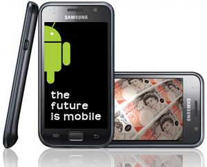
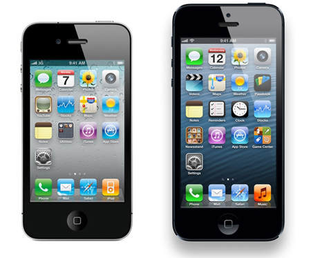
Last year we wrote about ‘the mobile future’. Well, that future has become the present. As a business owner, what are your options for entering the ever-growing mobile market? In the US, smartphones outnumber feature phones. In India, this year mobile web users will outnumber desktop web users. Not only is the mobile market growing but it’s becoming more profitable. Google recently added in-app subscriptions to the Play Store, PayPal is taking mobile to the high street and banks are getting in on the act led by Barclays Pingit. |
 |
Fears of security have been swept aside as mobile users worldwide devour information & entertainment on the go.
The opportunities for marketing are huge. Last year the mobile market was estimated to be worth $25-50 billion by 2015, but as China’s app market is valued at $35 billion those early figures massively undersell the mobile market.
Mobile at a Glance
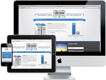
Users can access content on their smartphone or tablet in two ways – via a browser or by downloading an app. You should be making sure that potential customers can access your content via one of these options:
- Browser – Websites (desktop, mobile & responsive) and Web Apps
- Application – Native Apps
So which one should you choose? Use our helpful guide to decide!
We run an Android App Workshop, teaching you how to design, develop and market apps for the two most popular mobile operating systems - with a combined market share of 82% between them!
 Aaron Charlie
 5 Feb 2014
Responsive Web Design is becoming more and more widely used as a means to creating a site that is easily accessible on multiple platforms.
Grids are a particularly useful and simple way to build a responsive site, which is why you'll learn all about them on our Responsive Web Design Training.
With so many options to choose from, we thought we'd take a look at what we think are some of the best frameworks out there, each with its own unique strengths. Not 100% on Media Queries? Take a look at this post on the difference between queries and types.
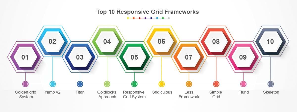
1/ Golden grid System
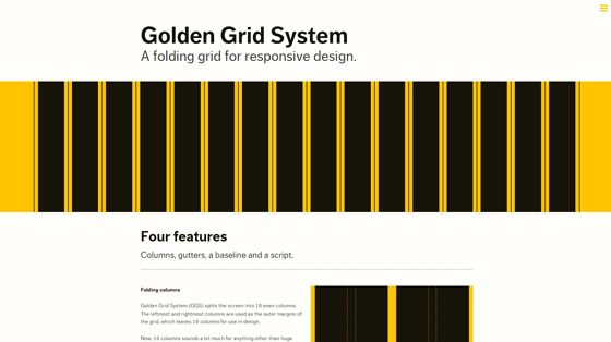
Golden Grid System splits the page into 18 columns, 16 of which can be used for design.
Using this system you'll be able to serve pages ranging from 240 to 2560px. It does this by 'folding' into 8 columns for tablets and 4 for mobiles.
2/ Yamb v2
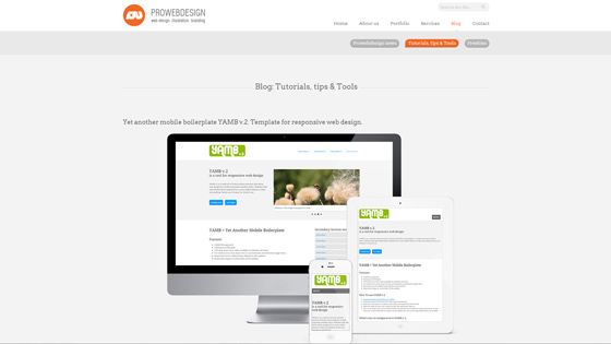
Yamb v2 is a mobile first framework which aims to deliver a minimalist approach to responsive design. As such it covers screen widths from 320px upwards.
Aaron Charlie
25 Mar 2013
If Windows 8 proves to be as popular and widely adopted as Windows 7, it could be huge for apps and responsive web design, taking the formats from mobile to a mainstream desktop market.
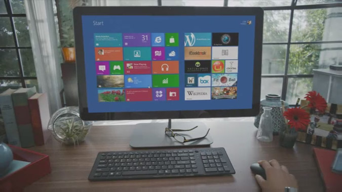
The booming mobile industry (dominated by iOS and Android) has seen apps go mainstream in the last few years. It has also prompted a radical change in web design with a desire for responsive design that adapts to browser size.
However, the number of websites with responsive design is still minuscule, and apps are still mostly for personal use on mobile devices. True synchronicity between desktop and mobile, (and between work and home) is still a long way off.
Windows 8 could be the catalyst to take app development and responsive design from mobile to desktop.
Stay ahead of the curve with our range of mobile development courses. We run Android App courses for native app developers as well as our highly popular mobile web week workshopwhich includes a day on responsive web design.
Windows 8 Apps
Sorry developers, it looks like you're going to have to learn to make apps for Windows 8 on top of Android and iOS.
Taking Apple's latest OSX update a step further, Microsoft have unveiled an operating system to work on all devices, desktop and mobile, by focusing on apps. They're a bit late to the party, with Apple have had an App store on desktop for a long time. But despite Apple's break into the market, Windows is still by far the global operating system of choice, particularly in workplaces.
Like Apple's App Store and Google Play, Microsoft is launching its own closed app marketplace and this is expected to become the norm for downloading software as it's often seen as 'safer' than downloading straight off the web, and easier than going into a shop and buying a disk.
Aaron Charlie
25 Oct 2012
What's that?
You've been advised to "keep it simple" on visuals and now you're even thinking about outsourcing your SEO efforts?
There's no need to skimp on form to enhance the function of your website.
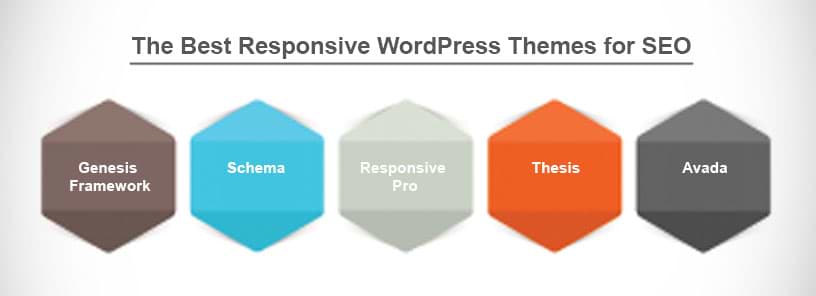
I've picked out five of the best responsive SEO friendly themes for your WordPress site that look great, but look even better in search.

Aaron Charlie
12 Mar 2015
CSS3 and HTML5 are changing the way we use the web, and how programmers and web designers build sites. Web browsers are quickly becoming compatible with HTML5 and CSS3's new tags and features, which are opening up a whole new world of possibilities.
One of those possibilities is the use of Responsive Web Design. In a world where mobile web browsing is ubiquitous, Responsive Web Design techniques allow designers to use flexible grids and page layouts in sites that will respond to user behaviour and adjust automatically to the user's browser capabilities and screen resolution of their device (meaning you don't have to make a different version of your site for every mobile phone and tablet out there). We'll be writing more about Responsive Web Design here soon (so watch this space!)

In response to the increase in demand for these skills we're now running regular HTML5 & CSS3 Training courses here in Brighton - the two 1-day workshops are scheduled together and can be booked together as a package. We're also running regular JavaScript Training and jQuery Training courses.
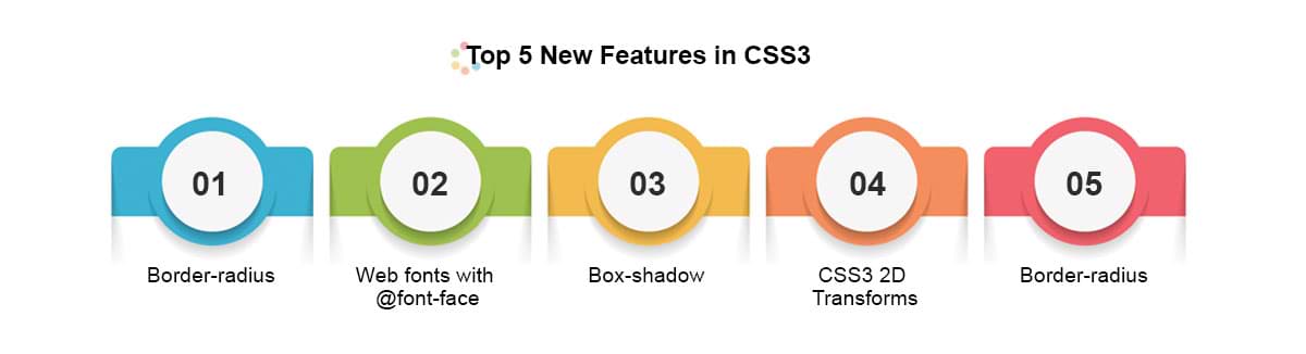
To give you an idea of some of the exciting new things you can do with CSS3 - here's our favourite 5 new features in CSS3, along with links to relevant CSS3 Examples.
Top 5 New Features in CSS3
1) Border-radius
The new border-radius feature in CSS3 comes as a great relief for anyone who has had to create rounded corners with corner images and extra DIVs: all you need is a few lines of CSS. It's not yet supported by IE7 and IE8, but you can use a CurvyCorners Script for these browsers.
CSS3 Border Radius Example
Aaron Charlie
23 May 2011
In this post, our responsive web design trainer Giselle guides you through the differences between Media Types and Media Queries with regards to modern web design.
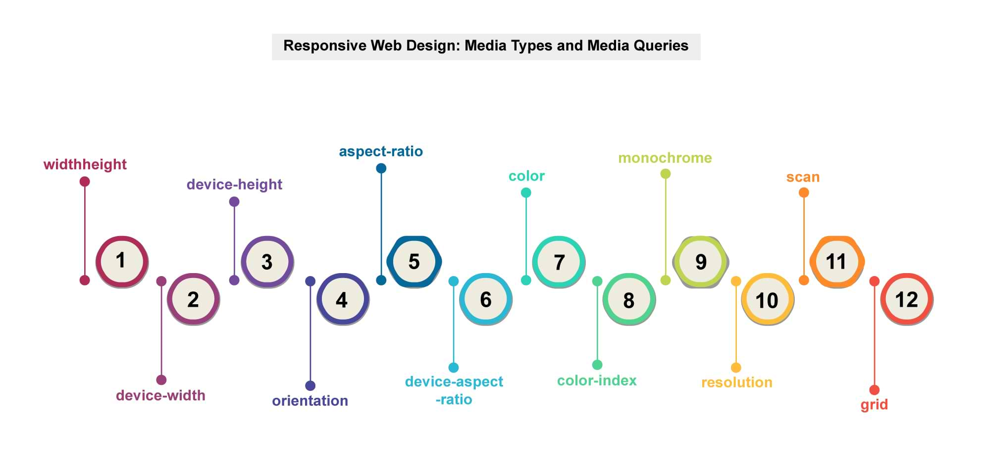
Media queriesis a new module in the CSS3 W3C (World Wide Web Consortium) specification. Media Queries combine the older Media Types, which target a particular media type - e.g. a screen - with conditions that must be met by a particular device in order for a set of styles to be applied to it - e.g. the width of a screen. Media queries enable you to change the appearance of your site for different devices while the HTML remains the same (although some of it may be hidden).
You can learn more about Media Queries in ourResponsive Web Design training.
Media Types
In the CSS2 specification Media Types targeted different devices but did not allow you to differentiate between devices of the same type but with different physical characteristics, e.g. two mobile phones with different screensizes.
Stylesheets for specific media were specified in the
of a page,
Orwithin a style sheet,
@media print {
body {
font-size: 12pt;
}
}
Other difficulties with Media Types included the fact that early mobile device browsers ignored them for the most part and later browsers defaulted to screen-based style sheets.
Giselle
4 Jan 2013
NEW! We've launched our ownResponsive Web Design Course. Learn how to design and build sites that will render on any screen without losing functionality with our best practice workshop. Combine the course with HTML5, CSS3 & JavaScript on our Mobile Web Week and you will be able to build your own sites from scratch!
5 years ago, the only considerations web designers really had to deal with when designing for different users were cross browser testing and different screen resolutions.
 |
Today (and forevermore!), to ensure that your website is truly accessible to all of your users, you have to make sure that your design works for a huge range of mobile devices - iPhones, iPads, Blackberries etc etc... all with different browsers and screen resolutions (many of which are now in 'portrait' orientation, as opposed to the traditional 'landscape' web browser)
One way of doing this is to design a different version of your site for every device - however that's a lot of work.
Enter Responsive Web Design..
What is Responsive Web Design?
Responsive Web design is an approach to web design that ensures that your site responds to your user’s environment, and to their behaviour, based on a range of variables including screen size, platform and orientation.
Rather than create multiple versions of a site for each device - ONE website design will be suitable for all users, by using flexible layouts, images and CSS techniques including media queries. The website adjusts itself to the user - rather than the other way round.
HTML5 and CSS3 are an important part of responsive web design, and as more and more browsers begin to support these technologies responsive websites will become more popular.
Aaron Charlie
20 Jun 2011
 Need Any Help?
Recent Blogs
 Enquire Now


