Craig Charley
2 Mar 2012
Mobile Web Design Checklist Free Download
It is very easy to open up your website on a smartphone or tablet and make the snap judgement that because it loads and the links work you can leave it as it is. However, how many businesses go the next step and think about how usable their site is on mobile devices? Or how attractive it is?
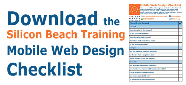
In this blog post, we have produced a checklist to help businesses perform a mobile site audit to ensure their site is as mobile-friendly as possible. Click the image to download the Silicon Beach Training Mobile Web Design Checklistand then read through this blog to find out why each point is so important.
Come on one of our Mobile Development Courses to learn how to create mobile websites and apps from scratch from our industry expert trainers. We run a beginners Mobile Web Design course which is suitable for all skill ranges and a Mobile Web Design Week workshop which is more advanced, containing HTML5, CSS3 and JavaScript training alongside an overview of mobile web best practice. For the more experienced programmers, we also provide iPhone App Development training and Android App Development Training. Read on to find out why mobile should be a top priority for business in 2012...
Why Go Mobile?
 Regular visitors to the site will know how strongly we believe that the future of technology lies with mobile. Our recent mobile post highlighted howApple sold more iPhones and iPads in 2011 than they sold computers in 11 years. That is a staggering stat. Another recent figure claims that1.45 million mobile devices enter the world every day compared to 317,124 births.
For whatever reason, mobile devices have achieved something that desktops and laptops never truly managed - they have become a consumer device. Nobody sees a desktop sitting at home, but people go out of their way to flaunt the latest smartphone and read the news on their iPad on the way to work. They have become a fashion accessory as much as a communication device.
As a result of this, more and more people are accessing the internet on the go on smaller screens. Any business that has not considered a mobile strategy is potential missing out on interest and sales. Mobile use has been proven to have a higher click through rates and higher average spend. So not only are some businesses missing out on potential customers but those customers are likely to spend more money!
Silicon Beach Training Mobile Web Design Checklist
This downloadable Mobile Web Design Checklist is not a definitive guide to styling websites for mobile devices but it is a useful list of features to consider to ensure a website works properly on a mobile device.
Content
Does the site fit the screen?
Experienced web designers know how important optimising a website for variable screens is. Without considering this a site that looks fantastic on a 24" LCD screen would look awful on an old 12" CRT screen. For businesses, it is important to appeal to the largest audience possible so when designing a site it is important that it loads on all screen sizes. This is equally as important for mobile screens.
Many mobile browsers automatically adjust the size of a page to the size of the device's screen but just in case, developers should ensure that the page width automatically adjusts;every time. The last thing you want is for objects and text floating off the right side of the screen out of site. One-direction scrolling is fine but it is impractical to have to scroll right and down when trying to view a site.
Is the content readable?
 One of the problems of websites automatically resizing in-browser is that the mobile device usually just zooms out to fit everything on screen. This usually results in making the text unreadable, forcing the user to zoom in. Ideally, mobile websites should load and be usable immediately without zooming or scrolling. This allows the user to get to the content as quickly as possible and reduces the chances of them leaving the site early.
Another consideration is that if a user zooms in then all the text will not be on their screen - they may miss out on something that interests them and you lose a customer.
Does the site load quickly?
Everybody hates waiting for a website to load when browsing the web. It is just about forgivable on a desktop because you can open other windows, programs and tabs. On a mobile, you are usually stuck with one window. If that window is always loading you are going to leave very quickly.
Improving page load speed has many benefits: higher bounce rate as users move through your site faster, higher ROI as customers can get to your products faster and even good SEO as Google claim they consider page load speed as a ranking factor.
Do videos and animations load?
Many mobile devices and browsers do not support Flash. Where a fantastic video or animation appears on your website normally, there is likely to be a big empty space when viewed on a mobile device.
Mobile users want information quickly, they don't want to hang around for content to load off to watch a video. Consider linking to video content rather than displaying it.
Is the site responsive?
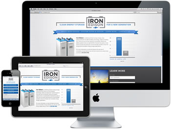
Responsive web design is extremely popular as there are now so many different ways to browse the web - from 3" smartphone screens to 100" projectors. Creating a responsive website means that you just create one site that displays itself according to the device and browser it is being viewed on. This is a much better solution than creating individual websites for different devices. Read more about responsive design in our blog post 'What is Responsive Web Design?'
An example of responsive web design:

Images
Are files sizes as small as possible?
File sizes should be small for two reasons. Firstly, mobile networks are slow and everyone hates long loading times. Secondly, nobody wants to use us 10mb of their 500mb allowance on your website. You can easily scale an image down to >50kb without losing any quality on a mobile screen.
Is there a home page icon set?
If your site contains useful resources then somebody might bookmark it a quick link on their phone or tablet. when they do it is likely that the image accompanying the bookmark will be a zoomed out screenshot of the page - doesn't look great. If you set a default icon for the site
Do all images fit on the screen?
It is not ideal for images to appear larger than the screen they're viewed on. Reducing image sizes or using fluid widths is a good way to make sure images are never too big for mobile devices.
Usability
Do gestures work?
The most popular websites for mobile devices are those that use touch gestures. Adding touch gesture actions to your site makes them user-friendly and utilises the technology available. Smartphones and tablets should not just be treated as smaller monitors - they have functions that desktops don't. Read more about touch gestures in web design.
Can a thumb click everything
 It's extremely frustrating trying to navigate around a website when all the links are next to each other in a tiny font - you always click on the wrong one. Links should be distanced and large enough to comfortably click using a thumb. Nobody will stay on your site if they can't navigate easily! Large buttons and text are ideal.
Are numbers and email addresses actionable?
It is easy to forget that the primary function of a smartphone is to call people. With that in mind, all phone numbers should be tagged appropriately so that users can click to call the number. If you are an AdWords user you can even then track that call data. This gives sites that rely mainly on telephone sales a way of tracking user conversions.
Are forms easy to fill out?
Again this comes down to size. Standard web forms are not easy to select with fingers. Once you have managed to click on the right box you don't want to be filling in your address and mobile keyboards still leave a lot to be desired. Minimise how much information you ask for and implement auto fill for addresses so that your visitors only have to enter their building number and postcode.
Would you stay on the site?
As a last check, visit your site on a couple of smartphones and tablets as if you are a new visitor. Imagine it is somebody else's site and see how attractive and usable it is. If you don't like it, your customers are unlikely to either.

 Regular visitors to the site will know how strongly we believe that the future of technology lies with mobile. Our recent mobile post highlighted howApple sold more iPhones and iPads in 2011 than they sold computers in 11 years. That is a staggering stat. Another recent figure claims that1.45 million mobile devices enter the world every day compared to 317,124 births.