Enquiry Now

 Contact Us


 Check Out
 +44 20 4571 2395

 PRINCE2® Foundation and Practitioner Training


 Giselle
 22 Nov 2012

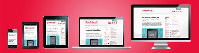
Responsive Web Design Testing Tools Round Up
Responsive Web Design is happening right now, it has hit the mainstream and will be around for quite a while. Once you've been on our Responsive Web Design course, there are a huge number of online tools to help you switch to a responsive design workflow and develop your skills and your sites even further. In this post, we're going to run through some of the best.
Responsive Design Workflow: You’re Going to Need a lot, Less Paper!
Workflows are changing with responsive design: there’s less reliance on mock-ups and more emphasis on HTML and CSS prototypes. Although these take longer initially, iterations in response to client feedback are much quicker as they can be done live. Responsive design heavily supports CSS instead of graphics wherever possible, meaning that the majority of tweaks will be made in the style sheet.
Read the case studies below to see what’s involved:
Luke Wroblewski - An Event Apart: The Responsive Designer’s Workflow
MEric Bidelman - Mobifying Your HTML5 Site

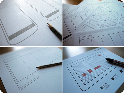
Wireframing Templates
Wireframes now need to include a range of devices, as well as consider how easy it is for the user to tap on areas of the screen. These free templates enable you to sketch your design on actual size, pre-created templates for seven mobile platforms.
Front-end Frameworks
Rather than starting your own templates from scratch you can use a framework and modify it for a particular project. Typical framework features include media queries, flexible grids, quick-build prototypes, mobility (making sure your site works on a range of mobile devices) and reusable components like navigation and alerts. Frameworks also include JavaScript to support features like CSS transitions, tabs and alerts. CSS styles are already set up so it’s a question of modifying and playing with them rather than creating your own.
Frameworks also help with iteration:
“The difference between a good site and a great site is iteration - building something, playing with it, refining it. In Foundation we've included dozens of styles to help you quickly prototype a site; multiple button sizes and styles, tabs, custom form elements, modal dialogues, image sliders and a lot more. All of the prototype elements are production-ready code, and easy to style up.” Foundation
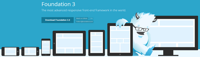
Foundation is one of the most popular responsive frameworks alongside Bootstrap.
Grid layouts
Responsive web design layouts use precise, grid-based layouts with columns and gutters. Grids can be calculated using fixed-width or flexible columns. Strictly speaking, responsive design uses flexible layouts. In reality, specific devices may be targeted at times. This is called adaptive rather than responsive design.
There are many grid-based layout tools online, either pre-created or modifiable.
Create fluid or fixed-width grids with a Variable Grid System by SprySoft.
Media-queries
Most responsive templates include media queries in the CSS. Make sure that any templates you choose are mobile-first if that is the strategy you have chosen for your website. Mobile-first means designing for mobile devices and then creating the CSS for the desktop.
Testing Tools
How do you check how your site looks on a range of mobile devices? Ideally, get hold of as many representative devices as possible, e.g. an iPhone and a Samsung smartphone running the Android operating system. Realistically, you will need online tools to help.
There are plenty of tools like mobiReady that tell you how ready your site is for mobile.
Firefox has a mobile device view; the screen resizes to show you how your site will look on different screen widths.
You can even use a mobile phone emulator to see how your site looks on actual phones on the market.
Smashing Magazine

Smashing Magazine is the internet's top authority on responsive web design, with regular news, features, guides, and reviews of tools. Check out their responsive web design category for the most up to date content out there.
The mobile experience also includes thinking about apps as a possible way to deliver content to your users. We now run an iOS course for non-developers - perfect for learning the basics of mobile development.
Posted under:
 Need Any Help?
Recent Blogs