 Enquiry Now

 Contact Us


 Check Out
 +44 20 4571 2395

 PRINCE2® Foundation and Practitioner Training


Responsive Web Design is happening right now, it has hit the mainstream and will be around for quite a while. Once you've been on our Responsive Web Design course, there are a huge number of online tools to help you switch to a responsive design workflow and develop your skills and your sites even further. In this post, we're going to run through some of the best.

Responsive Design Workflow: You’re Going to Need a lot, Less Paper!
Workflows are changing with responsive design: there’s less reliance on mock-ups and more emphasis on HTML and CSS prototypes. Although these take longer initially, iterations in response to client feedback are much quicker as they can be done live. Responsive design heavily supports CSS instead of graphics wherever possible, meaning that the majority of tweaks will be made in the style sheet.
Read the case studies below to see what’s involved:
Luke Wroblewski - An Event Apart: The Responsive Designer’s Workflow
MEric Bidelman - Mobifying Your HTML5 Site
Wireframing Templates
Wireframes now need to include a range of devices, as well as consider how easy it is for the user to tap on areas of the screen. These free templates enable you to sketch your design on actual size, pre-created templates for seven mobile platforms.
 Giselle
 22 Nov 2012
For a long time the industry standard tool for generating animated and interactive web content has been Flash.
The vast majority of animated content on the web including banners, intro sequences, ads, cartoons and even some navigation elements have traditionally been developed in Flash.
However - things have started to change over the past couple of years.
1) Apple rained on Adobe's parade by refusing to support Flash on iPhones and iPads - rendering any Flash content invisible to users of these devices (when over half a billion people are using mobile devices to browse the web - that's a big deal!)
2) The latest web standards including HTML5 & CSS3 and JavaScript libraries like jQueryare enabling developers to produce animated content that is more accessible and has faster load times than Flash

3) More and more browsers are now supporting HTML5 and CSS3
So if you can develop animated content that contains the same functionality as Flash, but will load faster and display properly on ALL browsers - what is the future for Flash...?
Enter Adobe Edge!
Aaron Charlie
10 Aug 2011
CSS3 and HTML5 are changing the way we use the web, and how programmers and web designers build sites. Web browsers are quickly becoming compatible with HTML5 and CSS3's new tags and features, which are opening up a whole new world of possibilities.
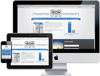
One of those possibilities is the use of Responsive Web Design. In a world where mobile web browsing is ubiquitous, Responsive Web Design techniques allow designers to use flexible grids and page layouts in sites that will respond to user behaviour and adjust automatically to the user's browser capabilities and screen resolution of their device (meaning you don't have to make a different version of your site for every mobile phone and tablet out there). We'll be writing more about Responsive Web Design here soon (so watch this space!)

In response to the increase in demand for these skills we're now running regular HTML5 & CSS3 Training courses here in Brighton - the two 1-day workshops are scheduled together and can be booked together as a package. We're also running regular JavaScript Training and jQuery Training courses.
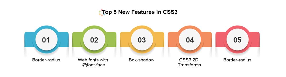
To give you an idea of some of the exciting new things you can do with CSS3 - here's our favourite 5 new features in CSS3, along with links to relevant CSS3 Examples.
Top 5 New Features in CSS3
1) Border-radius
The new border-radius feature in CSS3 comes as a great relief for anyone who has had to create rounded corners with corner images and extra DIVs: all you need is a few lines of CSS. It's not yet supported by IE7 and IE8, but you can use a CurvyCorners Script for these browsers.
CSS3 Border Radius Example
Aaron Charlie
23 May 2011
NEW! We've launched our ownResponsive Web Design Course. Learn how to design and build sites that will render on any screen without losing functionality with our best practice workshop. Combine the course with HTML5, CSS3 & JavaScript on our Mobile Web Week and you will be able to build your own sites from scratch!
5 years ago, the only considerations web designers really had to deal with when designing for different users were cross browser testing and different screen resolutions.
 |
Today (and forevermore!), to ensure that your website is truly accessible to all of your users, you have to make sure that your design works for a huge range of mobile devices - iPhones, iPads, Blackberries etc etc... all with different browsers and screen resolutions (many of which are now in 'portrait' orientation, as opposed to the traditional 'landscape' web browser)
One way of doing this is to design a different version of your site for every device - however that's a lot of work.
Enter Responsive Web Design..
What is Responsive Web Design?
Responsive Web design is an approach to web design that ensures that your site responds to your user’s environment, and to their behaviour, based on a range of variables including screen size, platform and orientation.
Rather than create multiple versions of a site for each device - ONE website design will be suitable for all users, by using flexible layouts, images and CSS techniques including media queries. The website adjusts itself to the user - rather than the other way round.
HTML5 and CSS3 are an important part of responsive web design, and as more and more browsers begin to support these technologies responsive websites will become more popular.
Aaron Charlie
20 Jun 2011
Google have just announced an incredible new Data Highlighter in Webmaster Tools which allows you to mark up events on your site with simple point-and-click actions.
This is a life saver for webmasters who want to add structured data to their sites but don't have the skills to implement microdata, microformats or RDFa on their site.
For those unfamiliar with structured data markup, it is code added to a site, page or page element that makes content more understandable to search engines and other crawlers which is then translated into Rich Snippets- extra information shown in SERPs with your result. Previously, this would involve marking up elements individually using tags like schemas but now with Google's new Data Highlighter even those with no understanding of HTML can markup certain elements.

The idea behind Structured Data is to take the internet beyond just an archive of 'pages' and instead becomes an 'internet of things' - something that search engines are racing to be the best at. It's something Facebook does - recognising people, relationships, faces and interests. Google are on the right track with authors, publishers, knowledge graph and semantic search but they need the help of webmasters to take this a step further.
Structured data is vital for SEO - something we're looking to add to our SEO courses - not only does it help search engines understand your content but also gives you more visibility in SERPs. Likewise it's a must for content marketers - not so much for blog posts but for other content that needs clear labelling.
Currently the Data Highlighter tool just for events, but we believe that if this test is successful then other elements will be supported. Google made a similar move by making authorship markup (rel=author) easier to implement using email verification rather than tags.
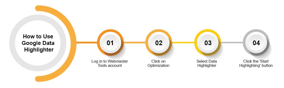
How to Use Google Data Highlighter
The main point of Google's new Data Highlighter tool is that it is dead simple to use. It just requires a Webmaster Tools account and (of course) events on your website.
Disclaimer: If you're thinking "I love the sound of extra real estate in SERPs, but I don't have events,
I had better set some up!" then please stop right there. Tools like these only work if they're not abused.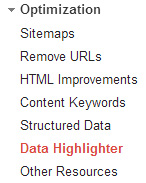
If you must, think hard about what real event you could put on - it could be a talk, a free session
or a demonstration - just don't set up fake events.
Firstly, log in to your Webmaster Tools account, click on Optimization in
the sidebar and select Data Highlighter. Then click the big red 'Start Highlighting' button.
Craig Charley
13 Dec 2012
HTML has had many incarnations over the years. All of these are similar, but successive refinements have been added over time to cope with our evolving understanding of the best way to make a website.
HTML5 has been on the radar for a while. As new browsers (including the new Firefox 4) start to support a wider range of HTML5 features, it's use among developers is sharply on the rise. To meet demand we now offer a regular public HTML5 & CSS3 Training course, which builds on the knowledge gained in our existing HTML& CSS Training Course.
We also provide a range of other Web Design courses including our Web Design Week and more advanced programming courses such as JavaScript, AJAX and jQuery.
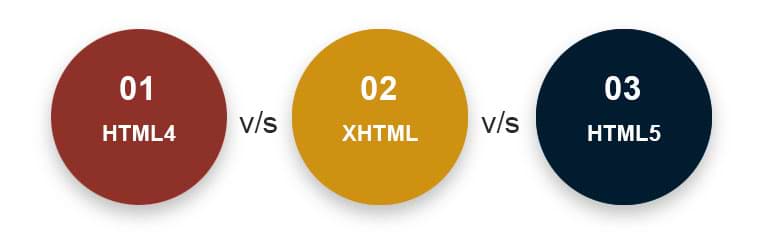
We still get asked a lot of questions about the different versions of HTML - especially the differences between HTML4 and HTML5. Throw XHTML in to the mix and it can be a confusing picture for the uninitiated!
So - here's our quick summary of the three main types of HTML in use today...
Aaron Charlie
30 Mar 2011
 Need Any Help?
Recent Blogs
 Enquire Now


