 Enquiry Now

 Contact Us


 Check Out
 +44 20 4571 2395

 PRINCE2® Foundation and Practitioner Training


Responsive web design is vital for making sure your visitors get as great an experience on their mobile as their desktop while browsing your site.
Our tutorials often aim at the beginner end of the scale, but this week we're going for something a bit more advanced. In this tutorial our HTML5 & CSS3 trainer Giselle explains how to convert navigation to a dropdown menu for smaller screens using CSS3 media queries.
This is one of the topics covered on our Mobile Web Design Week which combines our HTML5 & CSS3 Course with JavaScript training to give you a tool kit for designing mobile sites and also teaches you a best practice approach for responsive web design.

This tutorial assumes a familiarity with responsive web design and using CSS3 media queries to create different sets of styles for mobile devices. Click the links to find out more.
You do not have to test this in a mobile device. To test in your browser, simply resize your screen to the required width.
Why Convert to a Dropdown Menu?
If you have more than three buttons in your main navigation your menu will wrap or overlap when you decrease the width of your web page to fit it to a smaller mobile device screen. A popular method to get around this is to convert your menu to a dropdown. Other alternatives are to use display: block, or to use JavaScript or JQuery to toggle a menu when an icon or button is clicked on. Using display: block is a simple and quick way to style navigation for mobile dropdowns but won't work for menus with many links in them. Using JQuery to toggle the menu requires some knowledge of JQuery and JavaScript. Which method you use will depend on the particular site you are working on. This tutorial shows you how to use the first method and is quick and simple to implement.
 Giselle
 5 Oct 2012

Responsive Web Design is happening right now, it has hit the mainstream and will be around for quite a while. Once you've been on our Responsive Web Design course, there are a huge number of online tools to help you switch to a responsive design workflow and develop your skills and your sites even further. In this post, we're going to run through some of the best.

Responsive Design Workflow: You’re Going to Need a lot, Less Paper!
Workflows are changing with responsive design: there’s less reliance on mock-ups and more emphasis on HTML and CSS prototypes. Although these take longer initially, iterations in response to client feedback are much quicker as they can be done live. Responsive design heavily supports CSS instead of graphics wherever possible, meaning that the majority of tweaks will be made in the style sheet.
Read the case studies below to see what’s involved:
Luke Wroblewski - An Event Apart: The Responsive Designer’s Workflow
MEric Bidelman - Mobifying Your HTML5 Site
Wireframing Templates
Wireframes now need to include a range of devices, as well as consider how easy it is for the user to tap on areas of the screen. These free templates enable you to sketch your design on actual size, pre-created templates for seven mobile platforms.
Giselle
22 Nov 2012
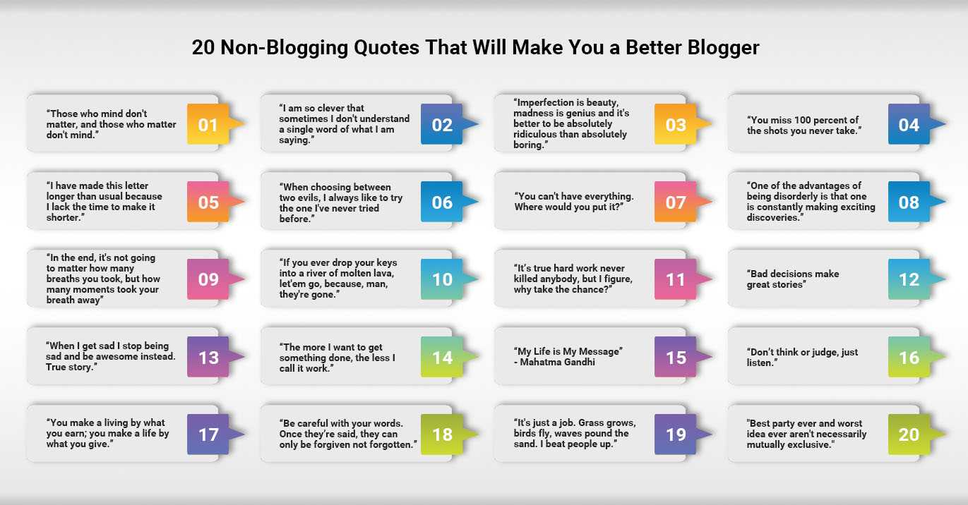
The famous and fabled are always reeling off catchy one-liners.
Some of them mean nothing, some are just funny and some are life-altering.
Most of these quotes were concocted prior to the existence of the internet, let alone blogging, but in many ways they’re appropriate as guidelines for online writers in the modern age.
None are steadfast rules but all contain something insightful.
Of course, to become a great blogger, you should come on our Blogging and Content Marketing Training which is ideal for both businesses and individuals.

So without further ado, here are 20 famous (or almost-famous) quotes that have nothing todo with blogging but which every blogger should remember.
Heather Buckley
26 Jul 2013
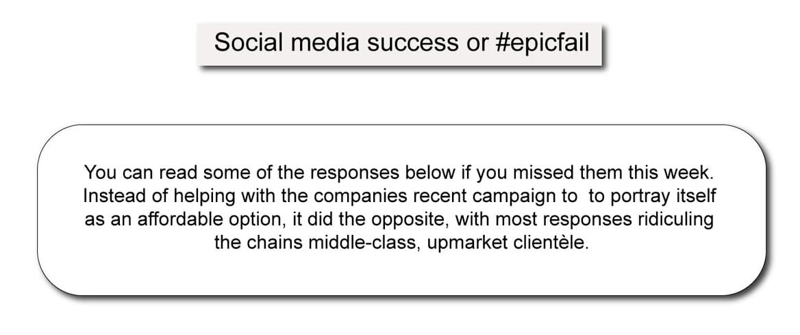
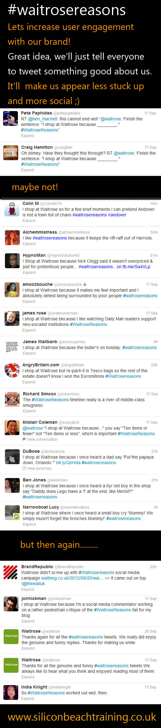
The marketing department at Waitrose became a little red faced this week after a Twitter marketing stunt turned viral but not quite the way they had planned.
Users were invited to compete the tweet “I shop at Waitrose because…” using the hashtag #WaitroseReasons.
You can read some of the responses below if you missed them this week. Instead of helping with the companies recent campaign to to portray itself as an affordable option, it did the opposite, with most responses ridiculing the chains middle-class, upmarket clientèle.
The moral of the story - Have a well planned out Social Media Strategy and be careful what you tweet for.
Look at our Content Marketing and Social Media courses if you need help to make Social Media work for you.
Are you a Digital Marketeer? What do you think - Success or Fail? Leave a comment below :)
Heather Buckley
21 Sep 2012
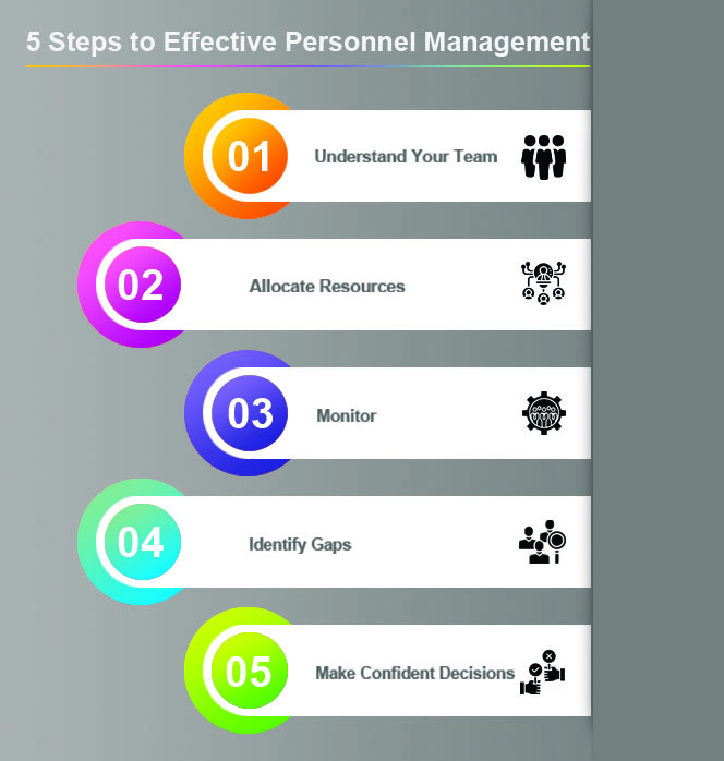
Effective personnel management is one of the hardest tasks for any manager but it's also one of the most important.

Managing large teams can feel like a never ending task. The minute you think you have a grasp of the team's availability and capabilities, something changes and it can feel like going back to square one.
You need to approach the different aspects of personnel management in the right order, at the right times, for the best chance of success.
In this post I outline my 5 Steps to Effective Personnel Management. Read through and see how they compare to your processes.
Andy Trainer
17 Jun 2014
 Need Any Help?
Recent Blogs
 Enquire Now


