Enquiry Now

 Contact Us


 Check Out
 +44 20 4571 2395

 PRINCE2® Foundation and Practitioner Training


 Aaron Charlie
 20 Jun 2011

What is Responsive Web Design?
NEW! We've launched our own Responsive Web Design Course. Learn how to design and build sites that will render on any screen without losing functionality with our best practice workshop. Combine the course with HTML5, CSS3 & JavaScript on our Mobile Web Week and you will be able to build your own sites from scratch!
5 years ago, the only considerations web designers really had to deal with when designing for different users were cross browser testing and different screen resolutions.
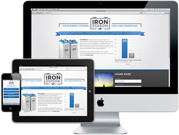 |
Today (and forevermore!), to ensure that your website is truly accessible to all of your users, you have to make sure that your design works for a huge range of mobile devices - iPhones, iPads, Blackberries etc etc... all with different browsers and screen resolutions (many of which are now in 'portrait' orientation, as opposed to the traditional 'landscape' web browser)
One way of doing this is to design a different version of your site for every device - however that's a lot of work.
Enter Responsive Web Design..
What is Responsive Web Design?
Responsive Web design is an approach to web design that ensures that your site responds to your user’s environment, and to their behaviour, based on a range of variables including screen size, platform and orientation.
Rather than create multiple versions of a site for each device - ONE website design will be suitable for all users, by using flexible layouts, images and CSS techniques including media queries. The website adjusts itself to the user - rather than the other way round.
HTML5 and CSS3 are an important part of responsive web design, and as more and more browsers begin to support these technologies responsive websites will become more popular.
Some Considerations for Responsive Web Design
Screen Resolution
Browsers now come in an almost infinite number of sizes and shapes - from the smallest mobile screen to the largest widescreen desktop monitor. Many devices (iPhones and iPads in particular) allow users to switch between landscape and portrait just by tilting their device. The image below illustrates the point
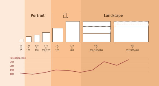
So just having your site re-size for each browser won't be enough, as a landscape design will look tiny in a portrait browser. The solutions to this include...
Flexible Layouts
Whatever device or browser you're using - go and take a look at http://www.alistapart.com/d/responsive-web-design/ex/ex-site-flexible.html#
Now try resizing your browser and see what happens - with the flexible layout this site uses, the page looks good in any format - the grid adjusts and the images re-size to fit your behaviour - you don't have to scroll horizontally to see content that's gone off the page.
This is achieved by a combination of flexible grids, and fluid images.
Custom Layout Structures
Resizing images and grids can be an effective solution - but really large changes in size may require a completely different layout structure for the page to display correctly.
Using some clever CSS - responsive web design techniques can get sites to display a different layout for each browser size.
In simple terms:
A CSS stylesheet will contain a number of page elements, including content, sidebars, footers, navigation bars etc...
In addition to a default stylesheet, responsive web designers can set up alternative sub-stylesheets (e.g. mobile.css) which use the same elements as the main one, but will be laid out differently for mobile devices. By detecting browser width, the site can switch to the mobile stylesheet. The site will use the same page elements - but it will be laid out in a structure that suits the smaller (or differently oriented) browser.
But how does this work...
CSS3 Media Queries
To determine the size of the browser that a user is viewing a site on - responsive web design uses Media Queries.
The simplest form of this is a CSS media query that detects the width of the browser, and then loads the right stylesheet to display a layout that will work well.
CSS3 offers even more flexibility, and has a range of new tags including min-width, max-width, device-width, orientation and color to detect even more about the user's browser capabilities and load in different stylsheets to deal with this.
The orientation tag especially is invaluable for detecting which way round someone is using their device.
You can read more about CSS3 Media Queries here.
JavaScript and jQuery
Unfortunately - not all browsers and devices support CSS3 yet. Luckily - there are some backup options with JavaScript and jQuery that will work without CSS3s.
There's a CSS3 Media Queries Library for Javascript that you can download, and you can also check out this great tutorial on combining media queries with JavaScript.
Responsive Web Design Training Options...
We hope this post has provided you with a useful overview of what Responsive Web Design is and how it can be used - however we've only really scratched the surface.
If you want to get really in-depth and learn these techniques hands-on, we offer a range of training courses on the technologies we've mentioned here:
HTML5 & CSS3 Training - 2-days: £495 + vat
JavaScript Training - 2-days: £495 + vat
jQuery Training - 3-days: £750 + vat
Please call us on 01273 622272 or e-mail info@siliconbeachtraining.co.uk for more details and bookings.
Posted under:
 Need Any Help?
Recent Blogs