 Enquiry Now

 Contact Us


 Check Out
 +44 20 4571 2395

 PRINCE2® Foundation and Practitioner Training


NEW! We've launched our ownResponsive Web Design Course. Learn how to design and build sites that will render on any screen without losing functionality with our best practice workshop. Combine the course with HTML5, CSS3 & JavaScript on our Mobile Web Week and you will be able to build your own sites from scratch!
5 years ago, the only considerations web designers really had to deal with when designing for different users were cross browser testing and different screen resolutions.
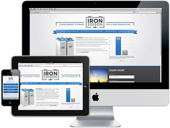 |
Today (and forevermore!), to ensure that your website is truly accessible to all of your users, you have to make sure that your design works for a huge range of mobile devices - iPhones, iPads, Blackberries etc etc... all with different browsers and screen resolutions (many of which are now in 'portrait' orientation, as opposed to the traditional 'landscape' web browser)
One way of doing this is to design a different version of your site for every device - however that's a lot of work.
Enter Responsive Web Design..
What is Responsive Web Design?
Responsive Web design is an approach to web design that ensures that your site responds to your user’s environment, and to their behaviour, based on a range of variables including screen size, platform and orientation.
Rather than create multiple versions of a site for each device - ONE website design will be suitable for all users, by using flexible layouts, images and CSS techniques including media queries. The website adjusts itself to the user - rather than the other way round.
HTML5 and CSS3 are an important part of responsive web design, and as more and more browsers begin to support these technologies responsive websites will become more popular.
 Aaron Charlie
 20 Jun 2011
 Need Any Help?
Recent Blogs
 Enquire Now


