 Enquiry Now

 Contact Us


 Check Out
 +44 20 4571 2395

 PRINCE2® Foundation and Practitioner Training


In this post, our responsive web design trainer Giselle guides you through the differences between Media Types and Media Queries with regards to modern web design.
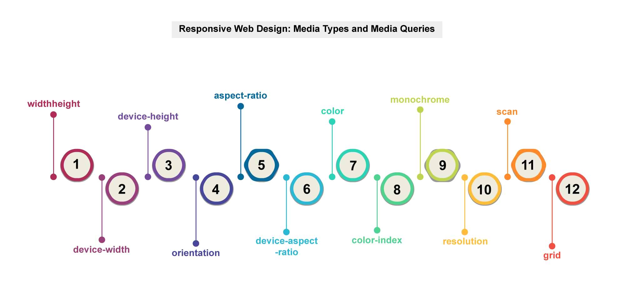
Media queriesis a new module in the CSS3 W3C (World Wide Web Consortium) specification. Media Queries combine the older Media Types, which target a particular media type - e.g. a screen - with conditions that must be met by a particular device in order for a set of styles to be applied to it - e.g. the width of a screen. Media queries enable you to change the appearance of your site for different devices while the HTML remains the same (although some of it may be hidden).
You can learn more about Media Queries in ourResponsive Web Design training.
Media Types
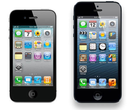
In the CSS2 specification Media Types targeted different devices but did not allow you to differentiate between devices of the same type but with different physical characteristics, e.g. two mobile phones with different screensizes.
Stylesheets for specific media were specified in the
of a page,
Orwithin a style sheet,
@media print {
body {
font-size: 12pt;
}
}
Other difficulties with Media Types included the fact that early mobile device browsers ignored them for the most part and later browsers defaulted to screen-based style sheets.
 Giselle
 4 Jan 2013
 Need Any Help?
Recent Blogs

 Enquire Now


