 Enquiry Now

 Contact Us


 Check Out
 +44 20 4571 2395

 PRINCE2® Foundation and Practitioner Training


Excel's Auto Sum feature is a handy time-saving feature that prevents you having to type out lists of commonly used values like sequences of numbers, days of the week or months. Auto Sum is covered in our Excel Beginners Training Course.
Written Instructions
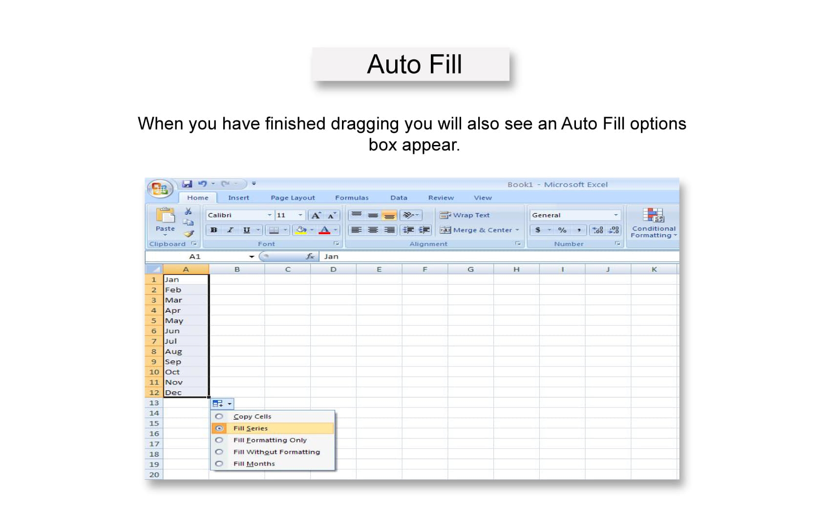
Let's demonstrate this with months. Type "January" in to a cell in your spreadsheet. Highlight the cell and you'll see that there's a little black arrow in the bottom right hand corner. Carefully click on this arrow with the mouse (a bit fiddly!) and hold the button. Now drag the box downwards a few cells and release, and Excel will fill in the subsequent months for you. Clever eh! Even better, it will also recognise abbreviations, such as Jan, Feb, Mar etc...

When you have finished dragging you will also see an Auto Fill options box appear.

If you click on this a drop down menu will appear showing you a list of further options. Whatever you press in this drop down menu will affect the series of numbers that you have created. If you would rather not have Excel type out all of the months and want all of the cells to say January, use the “copy cells” option
 Andy Trainer
 6 May 2009
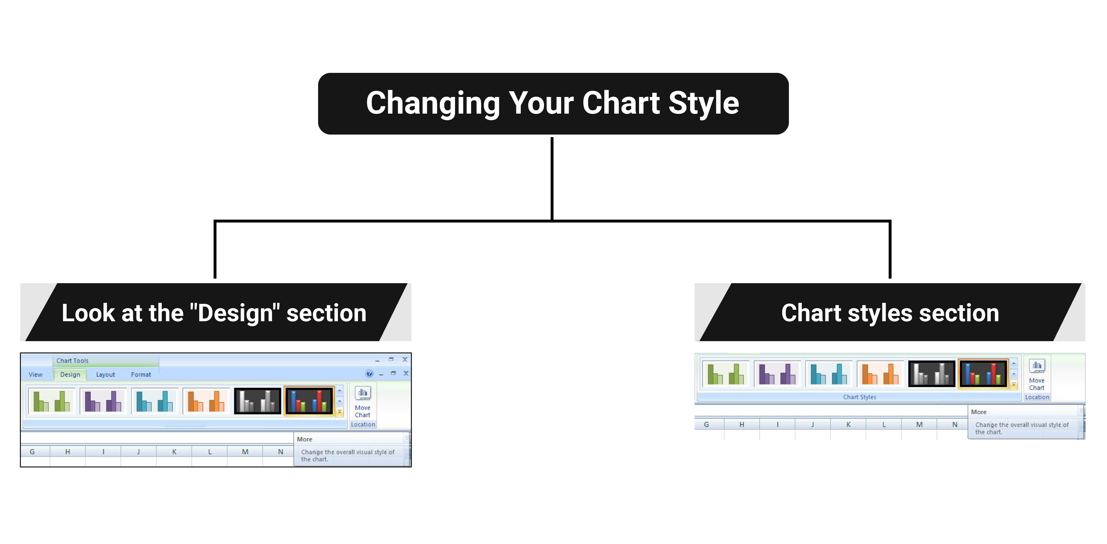
Once you're happy with the chart type, you can also change the style so that the colours and fonts fit with the image you want to portray.
Again - select your chart and look at the "design" section of the ribbon. You will find the chart styles section on the right hand side of the ribbon. For more options, click on the “More” arrow as indicated below:

In our example, select layout 42 at the bottom of the list. Excel will then automatically apply this to your chart, like this:

Andy Trainer
6 May 2009
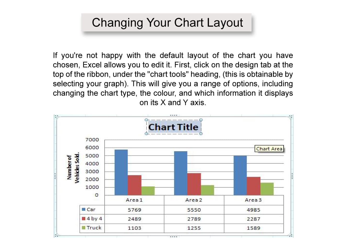
If you're not happy with the default layout of the chart you have chosen, Excel allows you to edit it. First, click on the design tab at the top of the ribbon, under the "chart tools" heading, (this is obtainable by selecting your graph). This will give you a range of options, including changing the chart type, the colour, and which information it displays on its X and Y axis.

In our example, select is layout 5. Excel 2007 will change your graph so that it now shows a main title, a title for the Y axis and a table of all the information used in the graph underneath the X axis.
In order to change the main title and the Y axis’ title all you need to do is to double click on the title itself and retype it.

Andy Trainer
6 May 2009
This tutorial is an extract from our popular 1-day Advanced Excel course. Lookup formulas are one of the most asked about topics so we decided to put together a short tutorial.
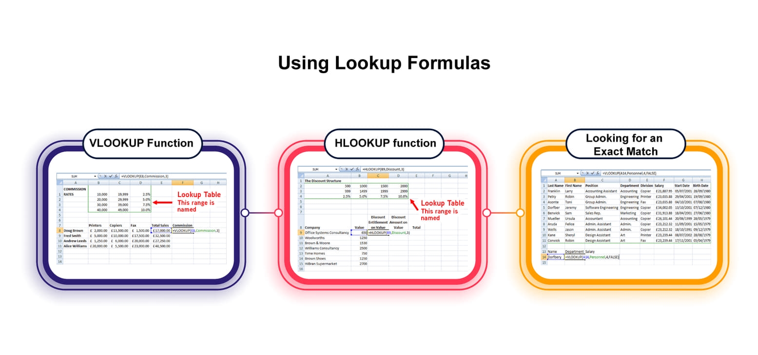
Lookup tables provide a way of producing numbers or text that cannot be calculated with a formula. For example they could look up a salesman's commission dependent on what has been sold (Example 1), or the amount of discount available to a customer based on the amount of goods ordered (Example 2).
Excel has two Lookup functions, Vertical and Horizontal.
VLOOKUP looks down the vertical column on the left side of the table until the appropriate comparison is found.
HLOOKUP looks across the horizontal row at the top of a column until the appropriate comparison is found.
Function Syntax
LOOKUP(lookup_value, table_array, col_index_num, range_lookup)
HLOOKUP(lookup_value, table_array, row_index_num, range_lookup)
Andy Trainer
14 Apr 2014

Excel can create a range of graphs and charts based on data in your spreadsheet, including line, column, area, line, pie, scatter, and bar charts.
Once created, Excel graphs will automatically update to represent any changes in data that you may make.
Before we start you'll need a set of data so that you can give Excel something to make a graph out of. Copy the data shown below, or use something similar that's relevant to you.

Using this example, highlight cells A5 to D8, i.e. all the information in the table apart from the total sales and the title. After you have highlighted the cells, click on the insert tab at the top of the ribbon which will give you a range of graph and chart options - select "column chart". You will now be presented with a list of column charts to choose from, select the “Clustered chart”; this is the first one in the list under the 2D section.

The following basic graph will appear containing the relevant information:

Andy Trainer
6 May 2009
 Need Any Help?
Recent Blogs


 Enquire Now


