Excel can create a range of graphs and charts based on data in your spreadsheet, including line, column, area, line, pie, scatter, and bar charts.
Once created, Excel graphs will automatically update to represent any changes in data that you may make.
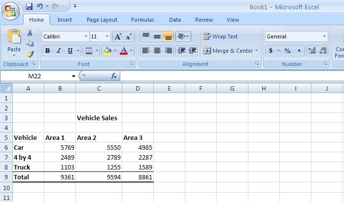
Before we start you'll need a set of data so that you can give Excel something to make a graph out of. Copy the data shown below, or use something similar that's relevant to you.

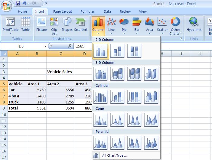
Using this example, highlight cells A5 to D8, i.e. all the information in the table apart from the total sales and the title. After you have highlighted the cells, click on the insert tab at the top of the ribbon which will give you a range of graph and chart options - select "column chart". You will now be presented with a list of column charts to choose from, select the “Clustered chart”; this is the first one in the list under the 2D section.

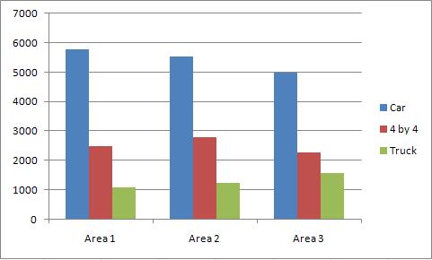
The following basic graph will appear containing the relevant information:

Andy Trainer
6 May 2009