 Enquiry Now

 Contact Us


 Check Out
 +44 20 4571 2395

 PRINCE2® Foundation and Practitioner Training


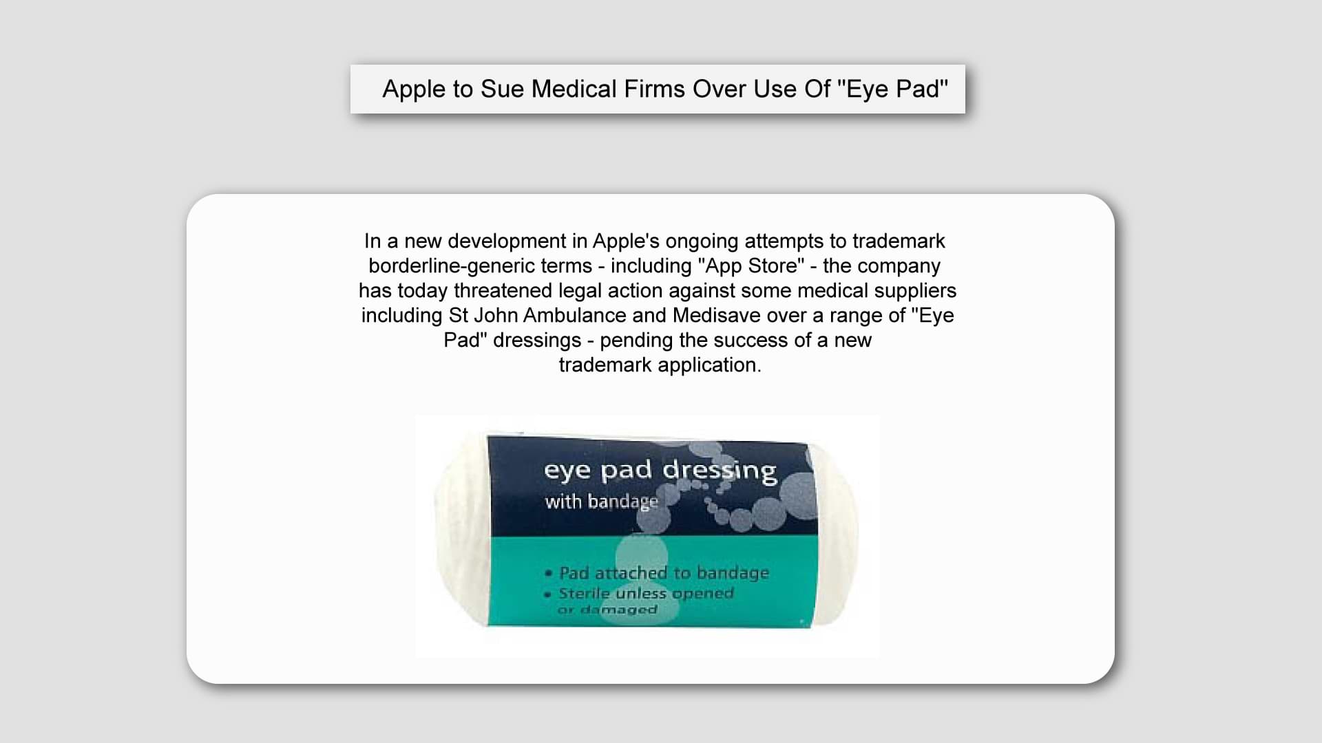
In a new development in Apple's ongoing attempts to trademark borderline-generic terms - including "App Store" - the company has today threatened legal action against some medical suppliers including St John Ambulance and Medisave over a range of "Eye Pad" dressings - pending the success of a new trademark application.

Only recently, Microsoft criticised Apple's attempts to trademark "App Store"; and recruited a professor of linguistics to support their claim that the term is generic and can be applied to any store that sells apps, in the same way, that "grocery store" can be used to describe any grocer.
However - if successful - this new move by Apple is set to establish a new legal precedent as it attempts to lay claim to the pronunciation of the name of its iconic tablet as well as just the word "iPad".
Dontcha Coppius, a spokesman for the Cupertino tech-giant, said in a statement this morning:
"These firms might not be spelling the name of their products in the same way, but consumers won't necessarily realise that if they hear the words spoken out loud. When someone says "hey, I just got two Eye Pads without even having to queue", that has the potential to devalue our brand. We're therefore looking to trademark the sound of the word "iPad" in order to protect that."
Silicon Beach Training spoke to corporate law specialist Khan Believu-Bortit about Apple's chances of success:

"I'm surprised at Apple's audacity in attempting to trademark the sound of a word, but if you look at the list of trademarks they already hold I wouldn't underestimate their chances. They have already got a trademark on Bonjour, for instance, and although this refers specifically to their networking technology, I know some of my French colleagues now greet each other very cautiously for fear of legal action."
Whilst commentators watch with interest as legal teams deliberate over Apple's latest claim, other retailers are apparently already taking action to protect themselves should the legislation pass.
Cadburys are reported to be hastily re-branding a range of hot-chocolate drinks whilst marketing teams at UK Supermarket giant Tesco have also been preparing new signage advertising "Green Tree-Based Fruit" for fear of censure over the term "Apple".
Silicon Beach Training offer a range of courses including Illustrator Training, Photoshop Training and InDesign Training. We also run other useful business courses including Leadership Training, Management Training, PRINCE2® Training
 Aaron Charlie
 16 Jun 2020
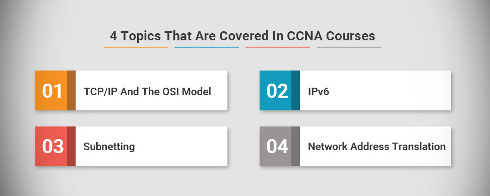
4 Topics That Are Covered In CCNA Courses
If you're looking to progress your IT career then taking the Cisco Certified Network Associate (CCNA) may be the way forward for you.
It's a well respected qualification that shows you're up to date in your networking sector. Here are four topics that are covered in the CCNA, and how they can help you in your career.
1. TCP/IP And The OSI Model
The Open Systems Interconnection is a way of standardising communication within network systems. The CCNA exam requires you to understand how this system breaks down communication into layers, and how they communicate with each other.
The Transmission Control Protocol and the Internet Protocol are two different networking based models, but they're both used to illustrate the way standard data transmission works online. Knowing how these both work will be essential in any CCNA courses you undertake.
2. IPv6
IPv6 refers to Internet Protocol "version 6". This latest iteration of Internet protocol gives more unique IP addresses, which are needed in times of business growth. Most businesses are now running on IPv6, so as a technician you will need to have knowledge of IPv6 in order to be a valuable asset.
3. Subnetting
Subnetting is a common network strategy that breaks networks into smaller components. Each subnet has a unique IP address, which interfaces with the group of subnets as a whole.
There are good reasons why this is commonly used in networks. One reason is because it makes it easier to diagnose and isolate issues when they occur. Secondly, you can then work on fixing an issue without taking the rest of the network down.
4. Network Address Translation
This is the process of modifying IP addresses in transit between two incompatible systems. It's becoming more commonly used in businesses as BYOD, or Bring Your Own Device, is becoming more popular in businesses.
Basic NAT is used to connect a user's smartphone or tablet to the network, and allow them to access network data. CCNA courses will cover basic NAT techniques, but there are more advanced courses available that you can pursue if you want to expand your knowledge.
Here at Silicon Beach Training, we have several courses, such as the CCNA training course, CCNA security training, and CCNA voice training, that can prepare you to pass your CCNA exam and find new opportunities in your industry.
If you're interested, get in touch. We can answer any questions that you have, and help you find the right course. We'll help you to acquire knowledge concerning CCNA, whilst obtaining this sought-after certification.
Luke Smith
25 Jul 2017

Some may be under the illusion that PRINCE2 is only valuable to those within the UK. Specifically, that the skills gained during the accreditation will only be applicable to the UK Information Technology market. You would be forgiven for thinking so with PRINCE’s history and origin. In the 1970’s, it began as PROMPTII Simpact Systems Ltd, created by the UK Government. In the 1980’s it underwent some changes was and renamed PRINCE. PRINCE2 came about in 1996 after the programme underwent further modifications. Another revision followed in 2009 and 2017 has brought us the latest update.
However, PRINCE2 is a versatile programme where the taught skills can be translated onto any project; whether it be organising a Bar Mitzvah, constructing and overseeing the building of a health clinic in Malawi, --READ MORE--to project management sectors in IT offices across the world.
Gary Murphy
11 Jul 2017
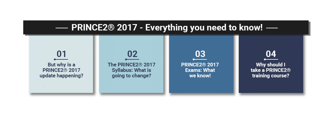
PRINCE2 2017 - Everything you need to know!
The world’s most practised project management methodology, PRINCE2 is changing from this July. It’s been a long time coming - with the last update being implemented eight years ago in 2009. AXELOS announced the changes at the beginning of January and they appear to have been met with a good reception! The methodology has been substantially modernised to meet the latest project management ideologies which have permeated businesses in recent years.
But why is a PRINCE2 2017 update happening?
AXELOS, the accrediting body, has been monitoring feedback from all over the world and keeping up with any changes that happen over time. They are keen to acknowledge and respond accordingly. As such, they came to the conclusion that the syllabus and exams should be updated to make the courses more practical, authoritative and relevant.
The PRINCE2 2017 Syllabus: What is going to change?
Elizabeth Sandwell
26 Jun 2017
We are delighted to announce that we have expanded further across the United Kingdom to ensure that we can cover all your training requirements in your local area!
Some of our New Locations:
- Manchester
- Birmingham
- Bristol
- Edinburgh
- Dublin
- Milton Keynes
To see the full list of locations please visit the link below:
Training Locations

Joseph Scott
25 May 2017
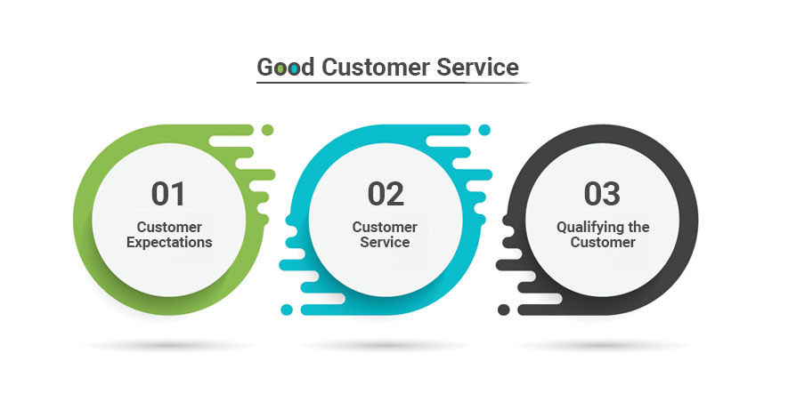
There are many techniques used to provide good customer service. Our blog writer John A G Smith is a fountain of knowledge and using his experience tells us about just one of these. if you want to learn more enquire about one of our private customer service courses.
No problem. When you stay in ‘Business Hotels’ this is a familiar scenario. Each morning, in a very short time span, a hundred business people arise from a hundred (or maybe fewer) beds and head for the showers. The hot-water storage tank gives up its contents in short order and those at the back of queue, or the top of the building, go cold. But good hotels, understanding this high demand, will have boilers that can cope so within a few minutes a heater with the power of a small thermonuclear device will restore the status quo and my day’s business will be back on track.......
John A G Smith
7 Oct 2016
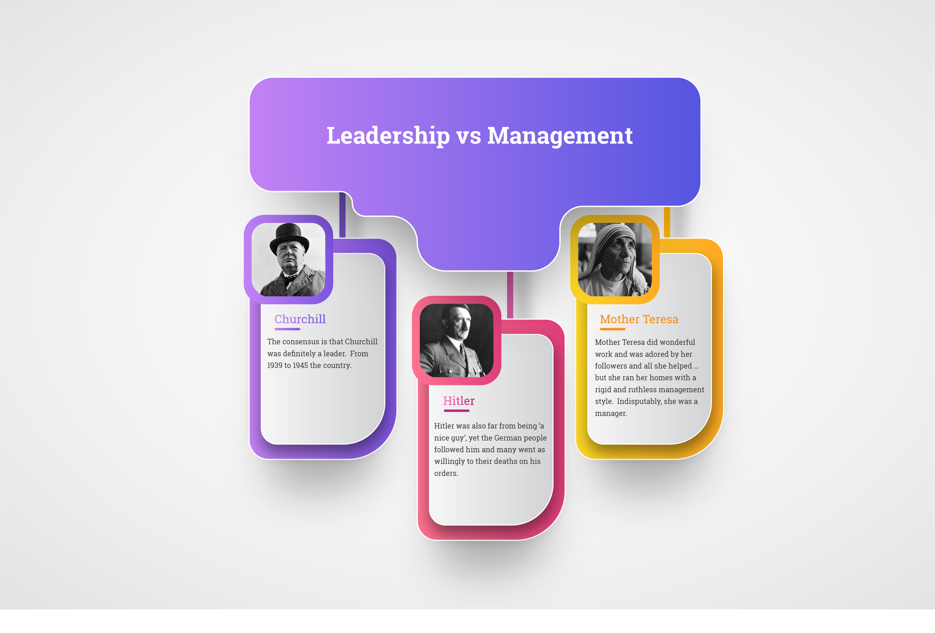
Congratulations! You got the promotion, but do you want to be a good leader or a good manager? Leadership skills and Management Skills for New Managers are 2 of our most popular business courses designed to help you on your way.
But what is the difference between a Leader and a Manager? I hear you ask..... using social history our expert John A G Smith explains.......

John A G Smith
23 Sep 2016
Every business needs to make changes but problems arise when there is no one in place to manage those changes......our writer John A G Smith helps explain how important Change Management is:
Harry studied the paperwork for a few minutes and then looked up.
“You’re absolutely right,” he said, “the change is essential and urgent. I’ll give you access to the Live Library. You and your team go ahead and build the change. When you you’ve tested it I’ll give you the password and you can put it into live.”
I was stunned. He was right about the urgency but this was way out of line. Here I was, just a subcontractor, being given the keys to the kingdom.
“What about Change Management?” I asked. “And doesn’t it have to go through the Change Advisory Board? Doesn’t anyone have to sign it off?”

“Nah.” He leaned back in his chair, legs straight and thrust his hands deep in his pockets. “The problem here is that our systems are too dynamic. We’ve got so many urgent changes going on that any sort of Change Management system will just get in the way. It would slow the whole thing up and be too much of a drag on everything.”
John A G Smith
26 Aug 2016
 Need Any Help?
Recent Blogs
 Enquire Now


