Enquiry Now

 Contact Us


 Check Out
 +44 20 4571 2395

 PRINCE2® Foundation and Practitioner Training


 Aaron Charlie
 25 Oct 2012

Windows 8, Apps and Responsive Web Design
If Windows 8 proves to be as popular and widely adopted as Windows 7, it could be huge for apps and responsive web design, taking the formats from mobile to a mainstream desktop market.
The booming mobile industry (dominated by iOS and Android) has seen apps go mainstream in the last few years. It has also prompted a radical change in web design with a desire for responsive design that adapts to browser size.
However, the number of websites with responsive design is still minuscule, and apps are still mostly for personal use on mobile devices. True synchronicity between desktop and mobile, (and between work and home) is still a long way off.
Windows 8 could be the catalyst to take app development and responsive design from mobile to desktop.
Stay ahead of the curve with our range of mobile development courses. We run Android App courses for native app developers as well as our highly popular mobile web week workshop which includes a day on responsive web design.
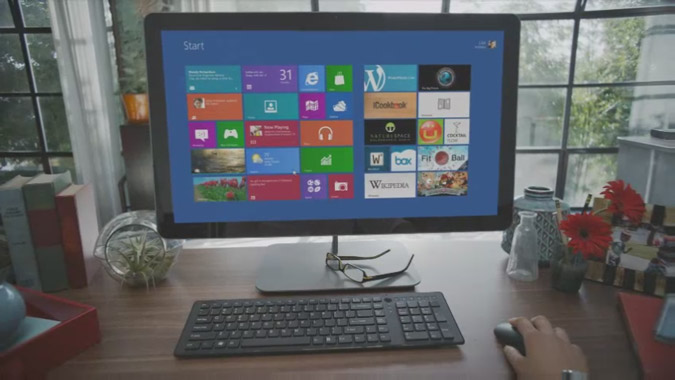
Windows 8 Apps
Sorry developers, it looks like you're going to have to learn to make apps for Windows 8 on top of Android and iOS.
Taking Apple's latest OSX update a step further, Microsoft have unveiled an operating system to work on all devices, desktop and mobile, by focusing on apps. They're a bit late to the party, with Apple have had an App store on desktop for a long time. But despite Apple's break into the market, Windows is still by far the global operating system of choice, particularly in workplaces.
Like Apple's App Store and Google Play, Microsoft is launching its own closed app marketplace and this is expected to become the norm for downloading software as it's often seen as 'safer' than downloading straight off the web, and easier than going into a shop and buying a disk.
Windows 8 Responsive Web Design
When designing websites for mobiles, the first decision is usually mobile first or responsive.
The demonstrator takes the new internet explorer browser application and drags and snaps it to the right of the screen, using a window about the width of a smartphone screen. Handy for keeping a site open while you complete other tasks, but not very useful if you can only see 1/5th of a website in a window that size.
With a responsive website, you could snap it out of the way at the side of the screen but it would still be fully functional. Not only that but it would be optimised to work even better at that browser size!
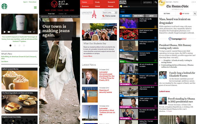
Here are some examples of sites that are fully responsive, to show why this is important for Windows 8:
Of course, this is already possible on Windows 7 by resizing your browser, but the addition of snap points on Windows 8 will certainly mean more people will start using it and will begin to expect responsive design as a result.
With a growing desire to be able to do many things at once, fully functioning websites that only take up 15% of screen real estate are going to attract attention.
Looking Forward
There are now three main competitors in the mobile/desktop OS battle. Apple with iOS and OSX, Google with Android & Chromebooks, Microsoft with Windows 8.
Microsoft has got the jump on Apple and Google by releasing the first cross-platform OS, but all three companies show how important it is to produce multi-device solutions for your business in the form of responsive web design and apps as consumers begin to expect good user experience on all platforms.
Posted under:
 Need Any Help?
Recent Blogs