Giselle
5 Oct 2012
How to Convert Navigation to a Dropdown Menu for Mobile Devices

Responsive web design is vital for making sure your visitors get as great an experience on their mobile as their desktop while browsing your site.
Our tutorials often aim at the beginner end of the scale, but this week we're going for something a bit more advanced. In this tutorial our HTML5 & CSS3 trainer Giselle explains how to convert navigation to a dropdown menu for smaller screens using CSS3 media queries.
This is one of the topics covered on our Mobile Web Design Week which combines our HTML5 & CSS3 Course with JavaScript training to give you a tool kit for designing mobile sites and also teaches you a best practice approach for responsive web design.
This tutorial assumes a familiarity with responsive web design and using CSS3 media queries to create different sets of styles for mobile devices. Click the links to find out more.
You do not have to test this in a mobile device. To test in your browser, simply resize your screen to the required width.
Why Convert to a Dropdown Menu?
If you have more than three buttons in your main navigation your menu will wrap or overlap when you decrease the width of your web page to fit it to a smaller mobile device screen. A popular method to get around this is to convert your menu to a dropdown. Other alternatives are to use display: block, or to use JavaScript or JQuery to toggle a menu when an icon or button is clicked on. Using display: block is a simple and quick way to style navigation for mobile dropdowns but won't work for menus with many links in them. Using JQuery to toggle the menu requires some knowledge of JQuery and JavaScript. Which method you use will depend on the particular site you are working on. This tutorial shows you how to use the first method and is quick and simple to implement.
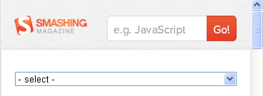
Example: Smashing Magazine
Wide Screen:

Narrow Screen:

The menu starts - as all menus do - with an unordered list. Add the HTML below to your page. Note that there will be two versions of the menu in the HTML and you will have to maintain both. If you'd prefer to only maintain one you'll need to use JQuery or JavaScript.
HTML
Hide the select menu using display:none.
CSS
nav select {
display: none;
}
This is good for accessibility as it will hide the menu which isn't being used from screen readers.
NOTE: We are using a contextual or descendant selector to achieve this rather than a class which clutters up the code with the class attribute.
Determine the breakpoint (specific width) at which the menu will switch to a dropdown. The example below uses a media query for smartphones, both portrait and landscape. In other words, if the screen width is between 320px and 480px, the menu for wider screens is hidden and the select menu appears.
/* Smartphones (portrait and landscape) ----------- */
@media only screen
and (min-device-width : 320px)
and (max-device-width : 480px) {
nav ul {display: none;}
nav select {display: inline-block;}
}
IMPORTANT NOTE: Change min-device-width to min-width and max-device-width to max-width if testing in your browser rather than on a mobile device.
Summary
Advantages:
- Quick.
- Simple.
Disadvantages:
- You maintain two menus.
- You cannot style the select element with CSS so this option means that the browser will use default dropdown styles. You can, however, style the select element by using a JavaScript plugin such as Chosen:
