Enquiry Now

 Contact Us


 Check Out
 +44 20 4571 2395

 PRINCE2® Foundation and Practitioner Training


 Aaron Charlie
 25 Mar 2013
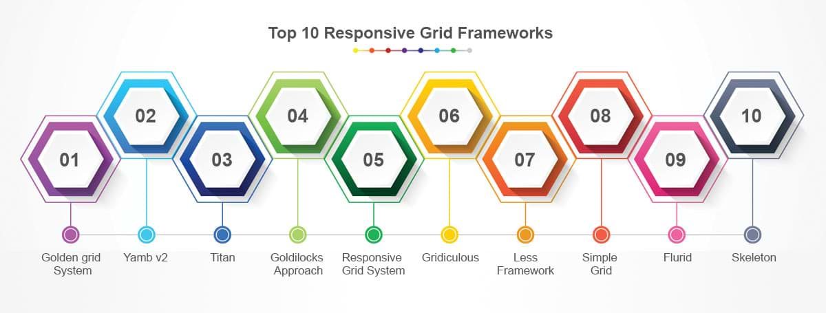
Top 10 Responsive Grid Frameworks
Top 10 Responsive Grid Frameworks
Responsive Web Design is becoming more and more widely used as a means to creating a site that is easily accessible on multiple platforms.
Grids are a particularly useful and simple way to build a responsive site, which is why you'll learn all about them on our Responsive Web Design Training.
With so many options to choose from, we thought we'd take a look at what we think are some of the best frameworks out there, each with its own unique strengths. Not 100% on Media Queries? Take a look at this post on the difference between queries and types.
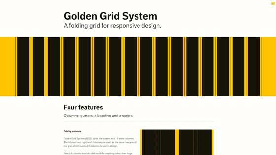
1/ Golden grid System

Golden Grid System splits the page into 18 columns, 16 of which can be used for design.
Using this system you'll be able to serve pages ranging from 240 to 2560px. It does this by 'folding' into 8 columns for tablets and 4 for mobiles.
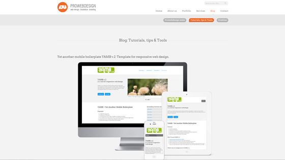
2/ Yamb v2

Yamb v2 is a mobile first framework which aims to deliver a minimalist approach to responsive design. As such it covers screen widths from 320px upwards.
It has some decent features like the conversion of drop-down menus into toggle buttons on small screens as well as touch responsive image function.
3/ Titan
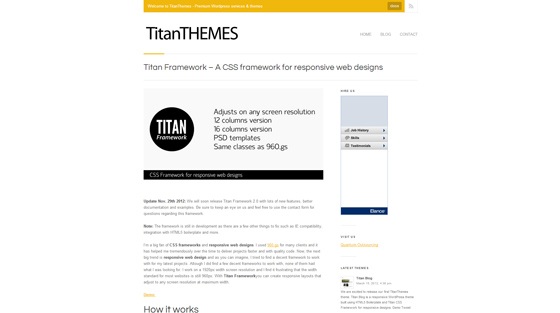
One of the more flexible frameworks in this list, Titan offers a choice between 12 or 16 columns. It also comes with the very useful feature of being able to to easily convert from 960.gs simply by replacing them with the Titan files.
4/ The Goldilocks Approach
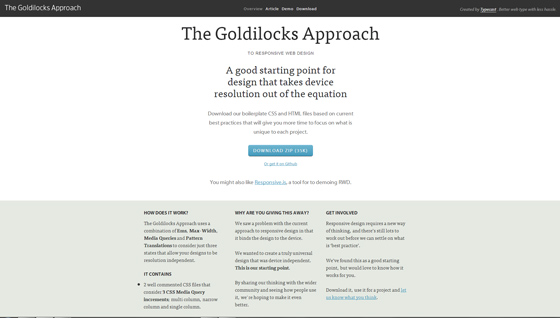
The Goldilocks Approach focuses on three particular states: multi column, narrow column and single column which means that you need not consider resolution.
It contains a boilerplate HTML file to get you going quickly.
5/ Responsive Grid System
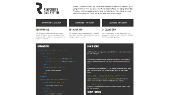
This framework does exactly what it says on the tin. Flexible yet simple, you can choose from 12, 16 or even 24 columns.
As well as taking a mobile-first approach, Responsive Grid System has the added benefit of being extremely lightweight.
6/ Gridiculous
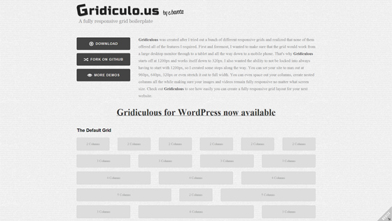
Ranging from 1200px down to 320px Gridiculous covers all the bases. You can space out your columns, create nested ones and set your site a limit of say 960px or even lower, if you don't want to go all the way to the full 1200px.
7/ Less Framework
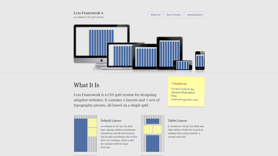
A comprehensive framework (somewhat ironically given its name), the Less Framework provides, as the creator calls it, 'graceful degradation'.
This means that rather than a mobile-first approach, it builds a 'default' page served up to most desktops and old browsers, and then a series of 'child' layouts (at sizes like 768, 480 and 320px) to be served to other devices.
Efficient and certainly worth a look if you're not keen on mobile-first.
8/ Simple Grid
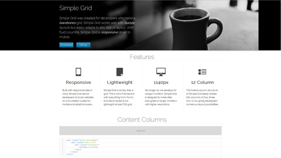
Simple Grid is another framework that manages to live up to its name. Lightweight, 12 columns and designed with high-res desktop monitors in mind, Simple Grid is the perfect framework for an introduction into the world of responsive.
9/ Flurid
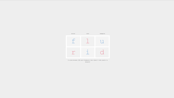
Another simple framework here (spot the theme!) Flurid allows for up to 16 columns, supports cross-browser viewing and most importantly as it says on the site itself, doesn't hide pixels in the margin.
10/ Skeleton
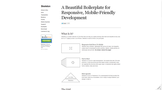
An efficient framework, Skeleton starts with a 960 grid and scales down to mobile. Its sleek and stylish layout makes it a favourite of designers and its speed and simplicity make it a favourite of developers as well. Possibly the pick of the bunch, depending on your needs.
So there you have 10 simple, useful and effective responsive grid frameworks.
Of course there are hundreds more that you can choose from and it's worth doing some thorough research to pick a framework that's best suited to you, but you can't go too far wrong with one of these as a decent starting point.
If you think you might need a refresh on your CSS to be able to use these layouts, come on our HTML5 & CSS3 Training Course or book it as part of our Mobile Web Design Week.
 Need Any Help?
Recent Blogs